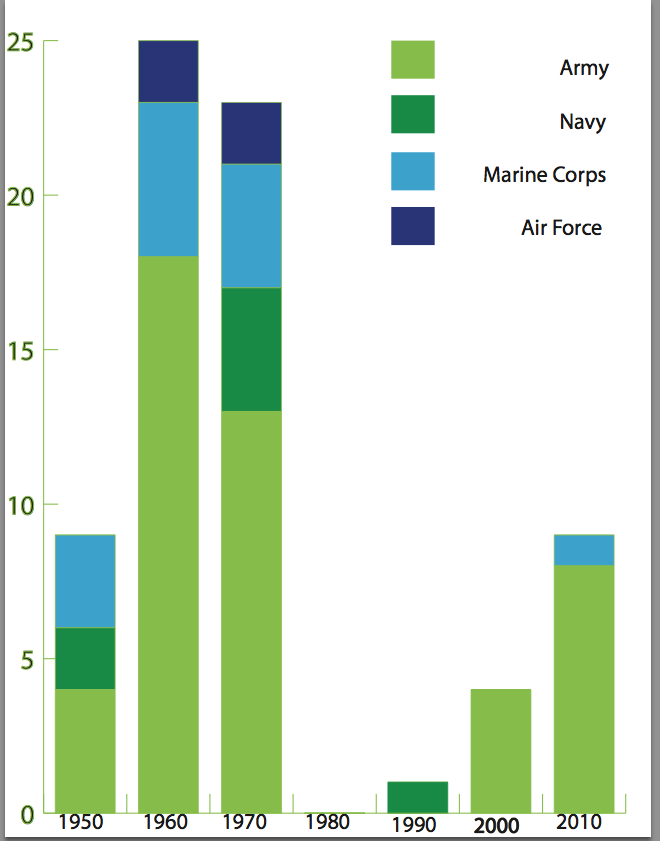
Graph showing the years of medal’s given and which branch of the military each recipient from that year represented.
Graph showing the years of medal’s given and which branch of the military each recipient from that year represented.
The number of minors in the Summer 2012 ranges from each country. The youngest athlete was 13 and from Togo. The highest number of minorities came from China. There were 7 14 year olds, 26 15 year olds, 66 16 year olds, and 114 17 year olds from all around the world.
CNN interactive map showing every person in the U.S. and Canada:
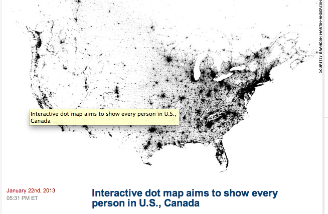
This story was particularly interesting to me because it is very interactive. Dating back to a year ago this coming week, this article represents each person in the U.S. and Canada by a black dot. It’s interesting to see the clutter of black dots in certain cities such as Washington D.C., New York City, and Los Angeles. It’s also fascinating to notice the distribution of the black clusters. For example compare the East Coast to the West Coast. The amount of white in the western part of America is quite different than the amount of black in the east. This interactive map though does not show descriptive roads or geographical locations so it might be hard to identify certain cities and states. This is not the first dot map yet it might be the first one to allot one dot per citizen.
http://whatsnext.blogs.cnn.com/2013/01/22/new-interactive-dot-map-aims-to-show-every-person-in-the-u-s/?iref=allsearch
New York Times interactive map about where poor and uninsured Americans live:
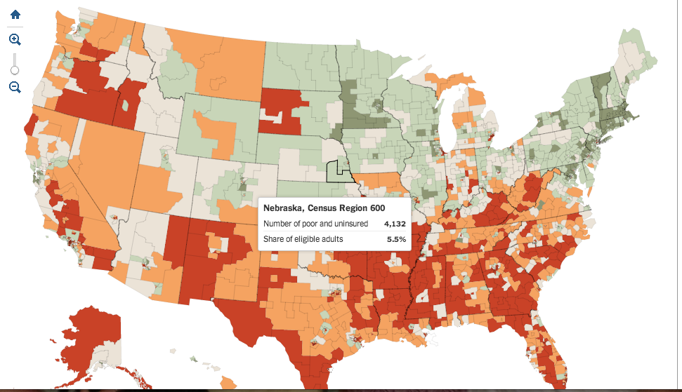
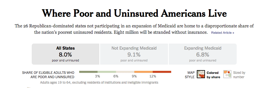
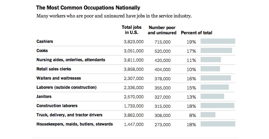
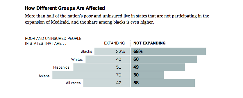
The article written in correspondence with this map is very interesting in the aspect of it gives you a different side of health coverage. Many people think they know what exactly health care is; who it covers and why it should or shouldn’t be approved. It’s fascinating to note in the interactive map you see the higher percentage of adults who are poor and uninsured in those places where Medicaid expansion is not being used. The data shows that cashier is the most common occupation with a staggering 19% unemployed. The astonishing part is the quote from Willie Charles Carter, an unemployed man in Mississippi who states “You got to be almost dead before you can get Medicaid in Mississippi.” This article gives a good details and has much data to show these statistics yet it is somewhat bias.
Gun Permit Holders in New York:
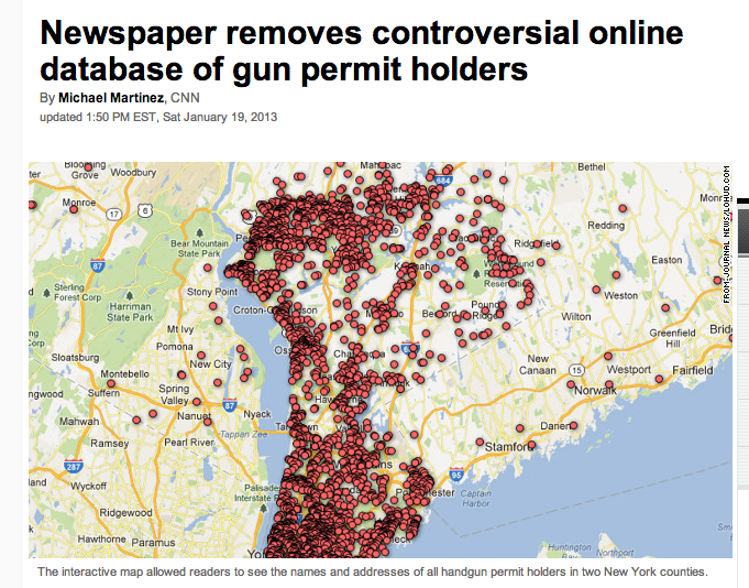
This interactive map shows the names and address of gun permit holders in two New York counties. It received many criticism from viewers and threats and thus the News Paper decided to take this map down. It shows if those who own gun permits have updated their licenses in the last 5 years by giving the representation of blue dots. Through the controversy the newspaper decided to keep a snapshot of the map on their website. This map came to be in the month after the devastating school shooting in Newtown, Connecticut. Is this map worth showing is a question brought up by readers.
http://www.cnn.com/2013/01/18/us/new-york-gun-permit-map/index.html?iref=allsearch