Assessing poverty in the lens of school free or reduce-price meals

Suburbia – the representation of the American dream – was once a place where people aspired to live. It represented security, stability and safety. Now suburbia is home to more than 16 million poor people.

Suburbia has the fastest growing poor population. During the 2000s, the population of poor people living in suburbs increased 64 percent and the poor population grew in 85 of the 95 nation’s largest metropolitan areas, according to The Brookings Institution.

More than 46 million people live in poverty in the U.S., according to the Census Bureau – a quarter of that number live in suburbia.

The popular understanding of poverty still collects images of people struggling in urban or rural areas, but there is not enough news coverage to show the true face of the issue.

A number of factors have left the suburbs vulnerable, including increasing populations, lower paying jobs and limited transit options. Although the federal government paid $82 billion a year across more than 80 programs to address poverty, most of this money went towards urban community development, according to The Brookings Institute. The issue in suburbs has not been adequately addressed.

School reduced or free lunches

For our final class project, we decided to look at poverty by assessing it in the lens of the school free or reduced lunch program. Food is all too often the first resource that people cut back on. Things such as housing and utilities take priority – then comes food.

Full-priced lunches cost $2.50 in Knox County elementary schools. A family-of-four must have an income of less than $43,568 to qualify for reduced-price meals or $30,615 for free meals, according to the U.S. Department of Agriculture. But USDA regulations prohibit schools from asking for proof of a parent’s income. To participate in the program, parents simply fill out a form stating their income at the beginning of the school year. Schools are required to verify a mere 3 percent of applicants. While fraud does occur, there is evidence in Knox County that the program is necessary.

Source:  Knox County Schools

In 2012, Green Magnet Academy and Lonsdale Elementary School recorded the highest numbers of elementary-aged students enrolled in the program, 79 percent and 78 percent respectively. Both schools are located in areas with some of the lowest per capita income figures in Knox County, according to Census Reporter. A. L. Lotts Elementary School and Farragut Intermediate School recorded the lowest numbers of enrollment that same year, 7 percent and 10 percent respectively. Both schools are located in areas with higher per capita income figures. Corryton Elementary School and Sunnyview Primary School’s numbers are representative of middle-of-the-road enrollment, and both schools are located in areas with similar middle-ground per capita income figures.

Source: Knox County Schools

While enrollment varies significantly on a school-to-school basis, fluctuations have been consistent throughout the past nine years. In 2009, Knox County Schools received $10.1 million in stimulus funds under Title I of of the 2001 No Child Left Behind Act. Twenty-three Title I classified schools existed before 2009. An additional 11 schools with temporary classification and 13 schools with short-term classification received stimulus funding. Superintendent Jim McIntyre also reduced the threshold for funding from 66.7 percent of students enrolled in the free or reduced-price meal program to 40 percent. As a result, student enrollment sharply increased across all Knox County elementary schools in 2009.

In 2012, the cost of full-priced lunches in Knox County elementary schools increased from $2.25 to $2.50 under the Healthy Hunger-Free Kids Act for equity in pricing on a national level. This resulted in another sharp increase in enrollment that continues today. At the end of 2013, 49.7 percent of Knox County students qualified for free or reduced-price meals.

Rounding out this project

Difficult topics such as suburban poverty tend to seem oblique. Humanizing this subject was definitely a hard task to manage.

Steele and I planned to interview principals of the elementary schools that we charted in color. However, we didn’t realize that the Tennessee Comprehensive Assessment Program testing would cause scheduling issues.

low res rajion

Falling from grace: How a backslide in recruiting temporarily sidetracked UT’s football program

As he prepared to finally answer the long-winded question, a small, reassuring grin crept onto his face, as if to say, “I got this one.”

The response in its entirety seemed to confirm his poised demeanor.

“We’re working to be the best,” Tennessee head coach Butch Jones said at his introductory press conference on Dec. 7, 2012. “We’re working to be number one every day.

“…This program has done it, and we’ll do it again.”


Once unanimously considered one of college football’s perennial powerhouses, the UT gridiron product yearned for Saturdays in the fall. With a raucous game day atmosphere thriving on both land and water, the Volunteers had established an eccentric and hostile environment that could morph Knoxville into a sea of orange on command.

From 1990 to 2004, UT averaged nearly 10 victories a year, produced seven double-digit-win seasons and was never absent from the postseason, winning eight of the 15 bowl games played during that time frame.

Three conference titles and four SEC championship game appearances were littered throughout the 15-year span — the climactic moment surfacing when UT navigated through the 1998 season unscathed, racking up a 13-0 record and the program’s first undisputed National Title since 1951.

But then — after this particular stretch concluded with the Vols punishing Texas A&M 38-7 in the 2005 Cotton Bowl — things began to shift.

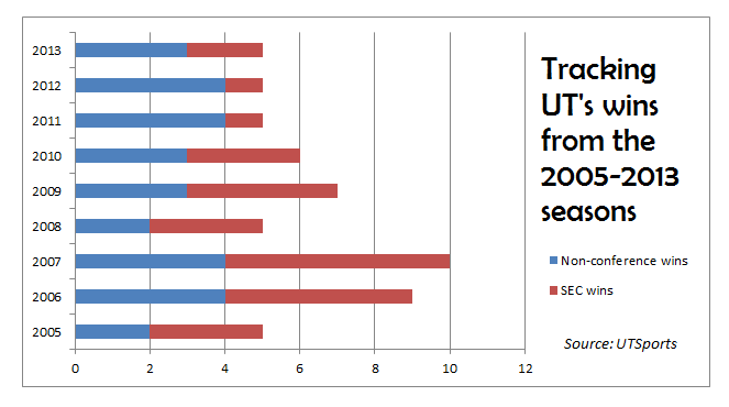
It happened over time, but the change infected the program tremendously, triggering an all-out free fall down to unexplored levels of mediocrity. In the nine years (2005-13) immediately after the Aggie rout, the Vols’ average season-win total plummeted to a little more than six a year, causing the Knoxville faithful to experience four postseason-free seasons.


One year of double-digit victories. One year with a SEC title-game berth. One year with a bowl win.

And three coaching changes.

So given the multitude of football success produced in recent history, why exactly did the final part of Jones’ response need to be in past tense?  This program has clearly “done it,” but why specifically is it not still “doing it”?

Recruiting breakdown   

Derek Dooley's lack of recruiting prowess during his stint as UT's head coach had a monumental effect on the Vols' football program.

The Daily Beacon

Derek Dooley wanted to make sure everyone tuning in knew this statement was important.

So as the emphatic words rolled off his tongue, the ex-Tennessee head football coach repeatedly tapped his middle finger on the table, indicating this proclamation of satisfaction should be bolded and underlined.

“This is the best that I have felt, as far as the future of our program and where we are headed, in the 24 months that I have been on the job,” Dooley said on Feb. 1, 2012, at his National Signing Day press conference. “It is a good day, men.”

With both confidence and assurance pouring out of Dooley’s words, his declaration didn’t appear to have any lingering particles of the prior campaign — an all-around dismal season, which ended with UT’s first loss to Kentucky in nearly 30 years.

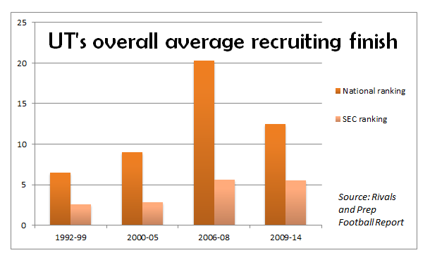
But while certain elements of the 2012 signing class did boast some cause for optimism — most notably former first-round draft pick Cordarrelle Paterson and current NFL defensive tackle prospect Daniel McCullers — the group as a whole finished just 17th in the nation according to Rivals.com.

In the nine-year span following the Texas A&M win (2005-13), the 2012 lot — ultimately Dooley’s worst recruiting haul in terms of rankings — was one of five classes to fall outside of Rivals’ top-10.

The lowest point of that stretch came in 2008, when despite coming off a SEC championship game appearance and an Outback Bowl victory over Wisconsin the previous year; ex-UT head coach Phillip Fulmer could only muster the 35th-best class in the country.

Ultimately, it was the last group he ever constructed as Fulmer was fired in Nov. 2008 following UT’s second losing season in four years. His final recruiting imprint was fifth-worst in the SEC — many miles away from where the Vols lived during most of Fulmer’s 17-year head coaching tenure.

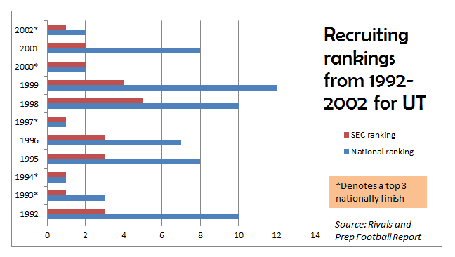
From 1992-2004, UT consistently stayed perched high atop the recruiting rankings, gazing down below at a bevy of conference foes.

To further analyze that 13-year period, Rivals rankings, which formed in 1998 but only has archives dating back to 2000, was implemented for signing classes 2000-04, and Tom Lemming — a former ESPN recruiting analyst who now produces yearly rankings for his own publication, Prep Football Report  —  was used to rank signing classes 1992-99.

According to those specifics, the Vols churned out top-10 classes in all but three seasons (1999, 2003 and 2004), were ranked No. 1 or No. 2 four different times (1994, 1997, 2000 and 2002) and finished third or better in the SEC nine out of the 13 seasons.


“It really hasn’t changed,” said UT defensive backs coach Willie Martinez on the importance and development of SEC recruiting. “It is the same as all. The great thing about it is we are at a great institution, and that gives us the opportunity to recruit the best of the best.”

Bring it home

The meteoric rise of Vanderbilt over the past five years has made dominating the state of Tennessee in recruiting difficult for the Vols.

The Daily Beacon

The last three conference champions — all of which made it to the BCS National Championship Game as well — placed a heavy emphasis on owning their home state in rugged battle that is SEC recruiting.

In 2013, 41 percent (47-of-115) of Auburn’s roster was homegrown talent. The previous season, the Crimson Tide had 42 percent (49-of-116) of its team come from the state of Alabama. And in 2011, LSU topped them both, producing a roster that was 55 percent (54-of-92) Bayou State natives.

And like his fellow SEC coaches had done before him, Jones acknowledged the blueprint and understood the importance of in-state recruiting almost immediately,

“Let me make no mistake that we are going to win first and foremost with the great state of Tennessee,” Jones said on Dec. 7, 2012. “We have tremendous high school coaches in this state. We are the state institution, and we will own our state. We are going to be at every high school in the state, and our players are going to understand what is to wear the power ‘T.’ They’re going to understand what it is to represent their home institution.”

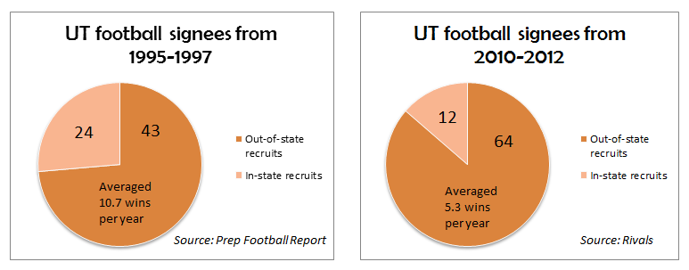
However, in Dooley’s tenure (2010-12), the Vols struggled mightily with in-state recruiting, signing only 16 percent (12-of-76) of its prospects from inside the borders of Tennessee.

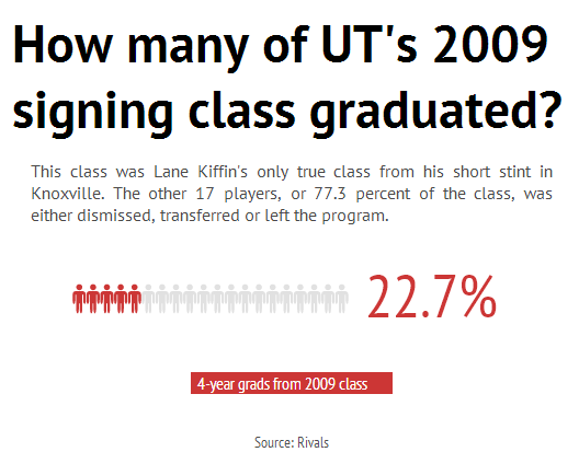
That trend, nevertheless, did change drastically in Jones’ first year at the helm as 27 percent (6-of-22) of UT’s 2013 signing class were homegrown products — the highest one-year percentage since Lane Kiffin inked the exact same ratio in 2009.


“Well I think that we’re going to have great relationships in this state because we’re going to recruit this state well,” tight ends coach Mark Elder said on Feb. 6, 2013, at UT’s National Signing Day press conference. “We’re going to put our emphasis on this state, and we’ve got great people on this staff.

“So looking forward, I mean it’s going to be a great relationship within the state. I think the football here is really good, you can certainly sign a number of guys in the state and win championships with the guys in the state.”

That method was certainly implemented during the Vols’ rise to national prominence. From 1994-2004, Fulmer and his staff signed 60 in-state prospects, including 24 in a three-year span (1995-97).


And as to UT’s on-field performance in those three years where in-state recruiting was the most prevalent? A 32-5 overall record with double-digit wins in each season, as well as an SEC title and a BCS bowl appearance.

“Every great program starts with securing its home state,” Jones said on Feb. 5 after signing the highest percentage (32 percent) of in-state prospects at UT since 2007. “And we have to do that each and every year, and I am very excited to be able to do that this year.”

Casey and Samantha

494 example 2


Losses per year


Playoff appearances


Using D3.js

D3 (or Data-Driven Documents) is an open-source JavaScript library for making data visualizations. Pretty cool, eh?

Oh…you’re asking yourself, “what is an open-source JavaScript library?” Well, the first part, open source, means that the source code is publicly available. In many cases, open-source software can be freely downloaded, edited and re-published. For more information about open-source software, check out this annotated guide.

The second part, javascript library, means that it is a collection of JavaScript functions that you can reference in your code. Basically, it is a bunch of code that other people wrote so you don’t have to! All you have to do is point to the library and tell it what you want to do.

Pointing to the library is easy. You just use the <script> tag and tell the browser what script you want. Generally, you can either host the library on your server or point to the library on the creators server. If you point to their server, you’ll automatically get updates (depending on their naming/workflow), which is good and bad. It is good in that you are using the newest software. It is bad in that they might update something in a way that ruins your project. I personally lean toward hosting on my server.

To host on your server:

  1. Download the library from the D3 website.
  2. Upload the library to your server
  3. Point to the library using the following code:
<script src="/d3/d3.v3.min.js" charset="utf-8"></script>

To leave it on their server:

  1. Just insert this code:
<script src="http://d3js.org/d3.v3.min.js" charset="utf-8"></script>

We have successfully navigated step one. Our browser will know that it needs to use JavaScript, because of the <script> tag, and it will load the correct JavaScript library, because we told it where the library is by using the src attribute.

Now we can move to step 2. Actually making a graphic using the library. To do this, we can just put directions in between the opening and closing <script> tags (which sounds easy).

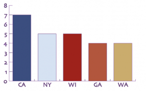
The first thing we have to understand about D3 is that we are using code to create everything in the chart. This is amazing, because it is highly adaptable and lightweight. This is also a drawback, because that means that there is a steep learning curve and can be a bit daunting at the beginning. Let’s start by looking at a chart and backing it down to it’s elements.

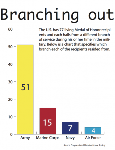
Medal of Honor recipient origin: Top 5 states

Medal of Honor recipient origin: Top 5 states


What do we need to create this graphic?

  1. Data
  2. Type of chart
  3. Axes and labels
  4. Color coding

We are going to need to explain that all to D3.

First, lets deal with the data. You can get data to D3 in numerous ways. For now we will enter the numbers in an array and assign it to a variable. You can also point D3 to CSV files, JSON data, and numerous other file types. I haven’t looked but I assume you could point to a Google Spreadsheet. Regardless, here is the snippet of code we’ll use to encode our data:

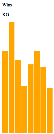
 var dataset = [ 12, 15, 20, 24, 25, 18, 27, 29];

This code should makes sense. We are creating a variable (var) named dataset and we are assigning our values to it.

Now we need to decide the way in which we want to display the data. For now, we will create a simple bar chart. So we need to style a bar. To do this we are going to use CSS (cascading style sheets), which we discussed a few weeks ago. We are going to assign the style to a DIV tag. We’ll add the class “bar,” so it isn’t applied to all DIVs on our page. Here is the snippet of code:

div.bar {
 display: inline-block;
 width: 20px;
 height: 75px;  
 margin-right: 2px;
 background-color: teal;
 }

This will make the default bar 20px wide, teal, and with a 2px margin. Right now, the bar is 75px tall, but we will adjust that based on our data.

Finally, we need tell our browser that we want to use D3 to use this style to draw a bunch of bars representing our data. Here is the code we’ll use to do that:

 d3.select("body").selectAll("div")
 .data(dataset)
 .enter()
 .append("div")
 .attr("class", "bar")
 .style("height", function(d) {
 var barHeight = d * 5;
 return barHeight + "px";
 });

OK…this snippet of code looks a lot more confusing. In English, this code says, “Append each item in our dataset to a div of the class bar and adjust the height of the bar based on its value.”

One of the coolest things about D3 is using the built-in “d” variable to cycle through all the values in a dataset. In our case, D3 pulls up each value then multiples it by 5 and assigns that value to the height of the bar it is drawing.

Now we have all the building blocks for a basic bar chart. We can organize it in an HTML as follows:

<html lang="en">
 <head>
 <meta charset="utf-8">
 <title>D3 Demo: Making a bar chart with divs</title>
 <script type="text/javascript" src="../d3/d3.v2.js"></script>
 <style type="text/css">
 
 div.bar {
 display: inline-block;
 width: 20px;
 height: 75px;
 margin-right: 2px;
 background-color: teal;
 }
 
 </style>
 </head>
 <body>
 <script type="text/javascript">
var dataset = [ 12, 15, 20, 24, 25, 18, 27, 29 ];
 
 d3.select("body").selectAll("div")
 .data(dataset)
 .enter()
 .append("div")
 .attr("class", "bar")
 .style("height", function(d) {
 var barHeight = d * 5;
 return barHeight + "px";
 });
 
 </script>
 </body>
</html>

If we uploaded that file, we would get the following chart:

Screen Shot 2014-04-22 at 12.48.25 PM

Maybe it isn’t the most beautiful chart, but it is all code…no JPGs, no Google Charts…just code.

ED NOTE: I am not sure how long this will take in class, so I am skipping ahead to updating the dataset. I will come back to axes and labels. 

A code-driven chart is cool, but an interactive chart is even cooler. So let’s do that.

What we’ll have to do is add an object with which the user can interact (i.e., click). Then we’ll have to add code that tells D3 to listen for a click and update the data when it hears it. For the object, we’ll just create a simple set of text using the <p> tag. Here is the code we’ll use:

<p> Conference standing </p>

Now we need to add the Event Listener and tell it to update the data. Here is the code:

d3.select("p")
 .on("click", function() {

//New values for dataset

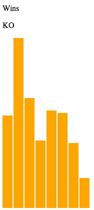
dataset = [ 7, 3, 4, 2, 2, 3, 2, 1 ];

//Update all bars
d3.selectAll("div")
  .data(dataset)
  .style("height", function(d) {
      var barHeight = d * 5;
      return barHeight + "px";
  });
});

Although this looks complex, we can easily walk through it. We are telling the browser to listen for any clicks within a <p> tag. Then once it hears the click, it executes the  function. Within the function, the dataset is updated with our new data and the bars are redrawn.

You can see the fruits of our labor here.

Pretty cool, but pretty useless. Am I right?

We can easily make this better by adding an IF command to our Event Listener. You should remember IF commands from some of our work in Excel. But basically an IF command says:

IF (logical statement comes back true) { 
     Do this
}
ELSE {
     Do this
}

We can start this process by giving our user two interaction options, like so:

 <p id="wins">Wins per year</p>
 <p id="conf">Conference</p>

We do the same thing as early – use the <p> tag – but this time we add unique id’s that we can reference later.

Then we just add the IF command to our Event Listener:

d3.selectAll("p")
 .on("click", function() {

 //See which p was clicked
 var paragraphID = d3.select(this).attr("id");
 
 //Decide what to do 
 if (paragraphID == "wins") {
   //New values for dataset
   dataset = [ 12, 15, 20, 24, 25, 18, 27, 29 ];
   //Update all bars
   d3.selectAll("div")
     .data(dataset)
     .style("height", function(d) {
        var barHeight = d * 5;
        return barHeight + "px";
     });
 } else {
   //New values for dataset
   dataset = [ 7, 3, 4, 2, 2, 3, 2, 1 ];
   //Update all bars
   d3.selectAll("div")
     .data(dataset)
     .style("height", function(d) {
        var barHeight = d * 5;
        return barHeight + "px";
      });
   }
 });

All that we added was two options. If the user clicks wins, we keep with the original dataset, and when the user clicks conference we insert the new dataset.

You can see the chart here.

And you can find the code on GitHub: https://github.com/ngeidner/d3_example