Here are my answers:
And here they are charted:
Here are my answers:
And here they are charted:
As you read, there are many ways data journalists end up finding data. It can be through existing databases or through good ol’ fashioned shoe leather reporting. Today we’ll play with a couple tools for making the search for data a bit easier.
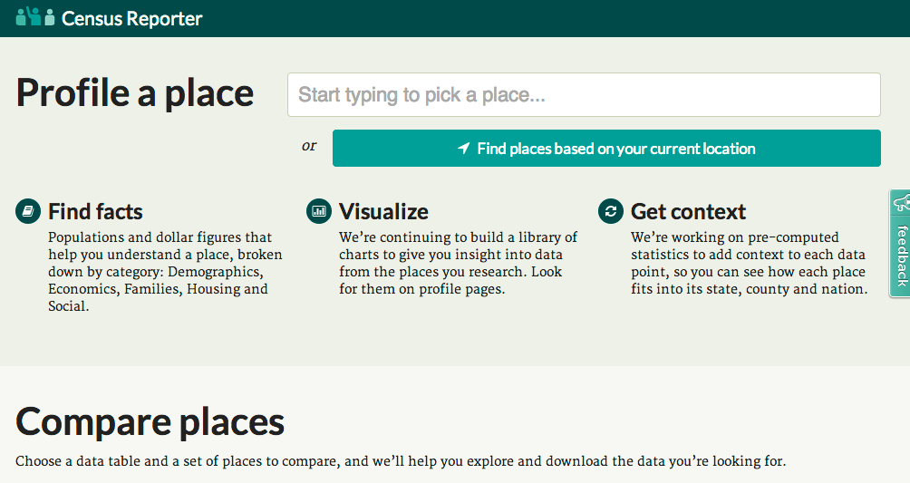
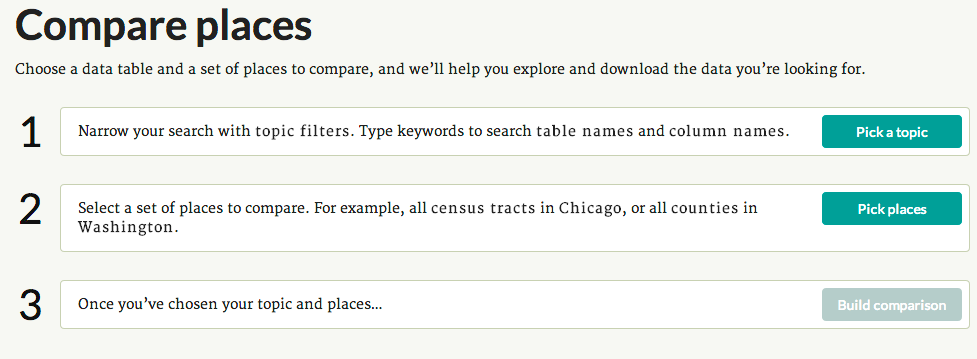
First up is Census Reporter. This Knight News Challenge funded project is an amazingly, simple source for local census data. Let’s say we want to find median household income by census track in Knox County. Usually, this would involve digging through the information provided via Census.gov (which is decently well-organized, but not the easiest to work with). With CensusReporter you just answer three questions in the “compare places” tool.
We’ll find that data now.

Next, we’ll look at Data.gov, the U.S. government’s data repository. This should be a starting point for searching for any data, which could be at all related to the federal government.
Let’s take some time to find a piece of data from the repository about University of Tennessee.
When you are looking locally it is a bit more hodge podge. Let’s try to look up some information and think about how we could collect that information.
What kind of information might we want to look up locally? Here are a couple examples:
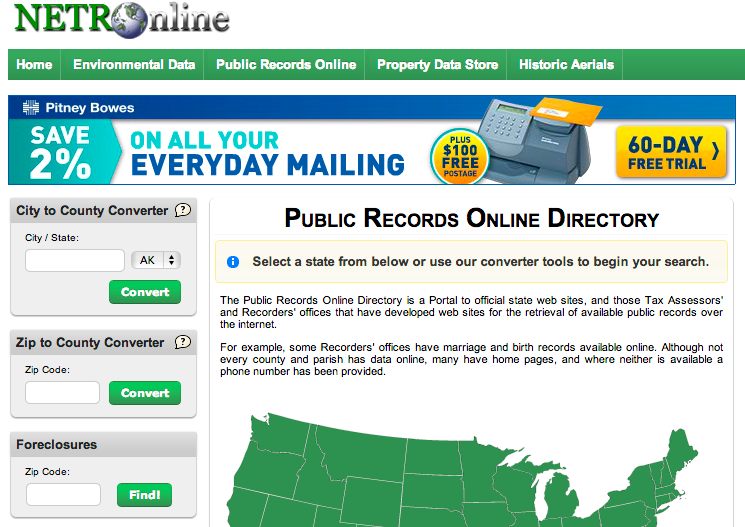
1) Property tax? Start with the public records online directory.
2) Meth labs? Try the Tenn Meth Task Force.

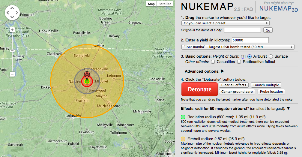
Who said mapping can’t be fun? Here are two examples of fun mapping projects.
The first one, NukeMap, lets you “create” a nuclear explosion anywhere in the world to see how large the fallout would be. The user can adjust the location, the size of the bomb, and a handful of other variables.
The second, BBC’s “How Big Really?”, is similar. It lets users see the relative size of important places, events and things (e.g., environmental disasters, the Mars rover path) by placing the footprint of the object on a more familiar area. For example, the map below shows the footprint of St. Peter’s Basilica at the Vatican placed in the middle of UT’s campus.


After looking at a bunch of example and reading about how people have done data journalism projects, you might be overwhelmed.
But don’t be!
Data journalism is storytelling, just like every other journalism you have done.
1) You start by identifying a story. The only difference is that we are looking for a particular type of story. We are looking for stories that are information/data heavy.
2) Once we have a story, we need to do the reporting for the story. For a print or video story, we would probably go out an interview sources. For data journalism, we want to find the appropriate dataset. There are three ways you might do this:
3) Once you have completed your reporting, you move to organizing the information. For print, you might transcribe an interview and read through it, pulling out the best quotes. For data journalism, you need to clean, sort, and analyze your data.
4) Next, you move on to organizing your story. In what way will you use the information you found? In this class, we will storyboard our project.
5) Finally, we will create the story, database, visualization, etc.
Through out the class, we will go through each step of this process. We will make sure that each group is on the right page at each step of the process.
We consume information every day.
Oftentimes we take for granted people who sift through information so that the public can be informed and/or entertained.
Sometimes, data visualization tells a story more clearly than print.
So here are some data visualizations that caught my eye:
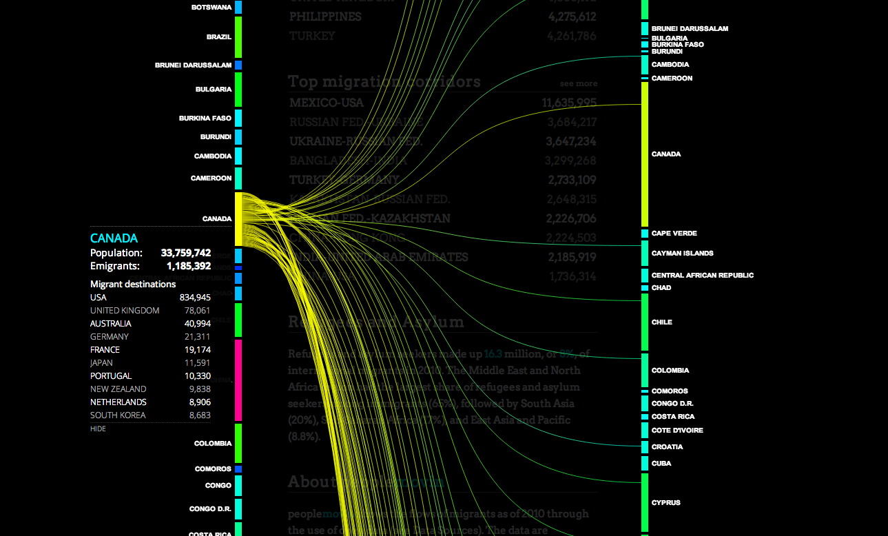
‘Peoplemovein is a visualization of migration around the world.
Both sides list a set of countries. Lines flow from one country depicting lines that increase in width as more people migrate from one country to their designated destination.
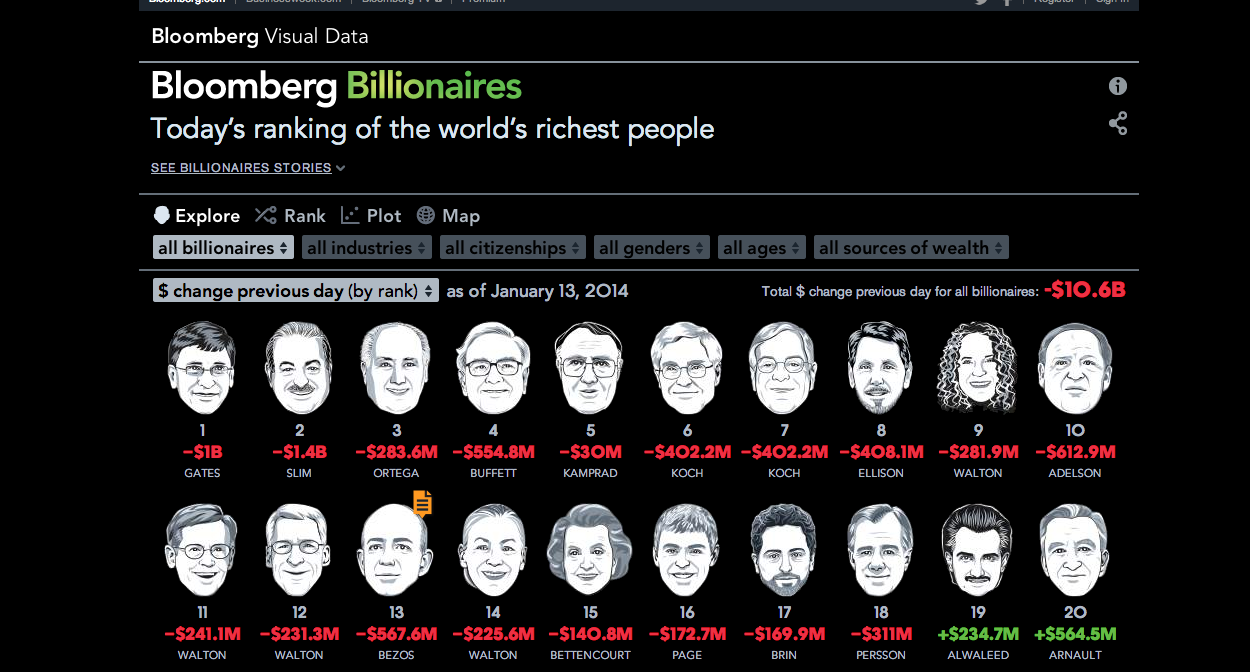
Bloomberg listed the richest people in the world with a caricature of their face and their net worth. A set of factors filter people by their industry, nationality, gender, age, and source of wealth.
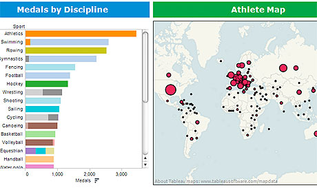
Olympics data: all our statistics, data journalism and visualizations in one place
Simon Rogers/The Guardian
Here is a unique way to display a very complex and large set of data. This graphic on the left shows the number of medals won in Olympic history, divided up by sport. On the right is the number of Olympic medals won broken down by each country.
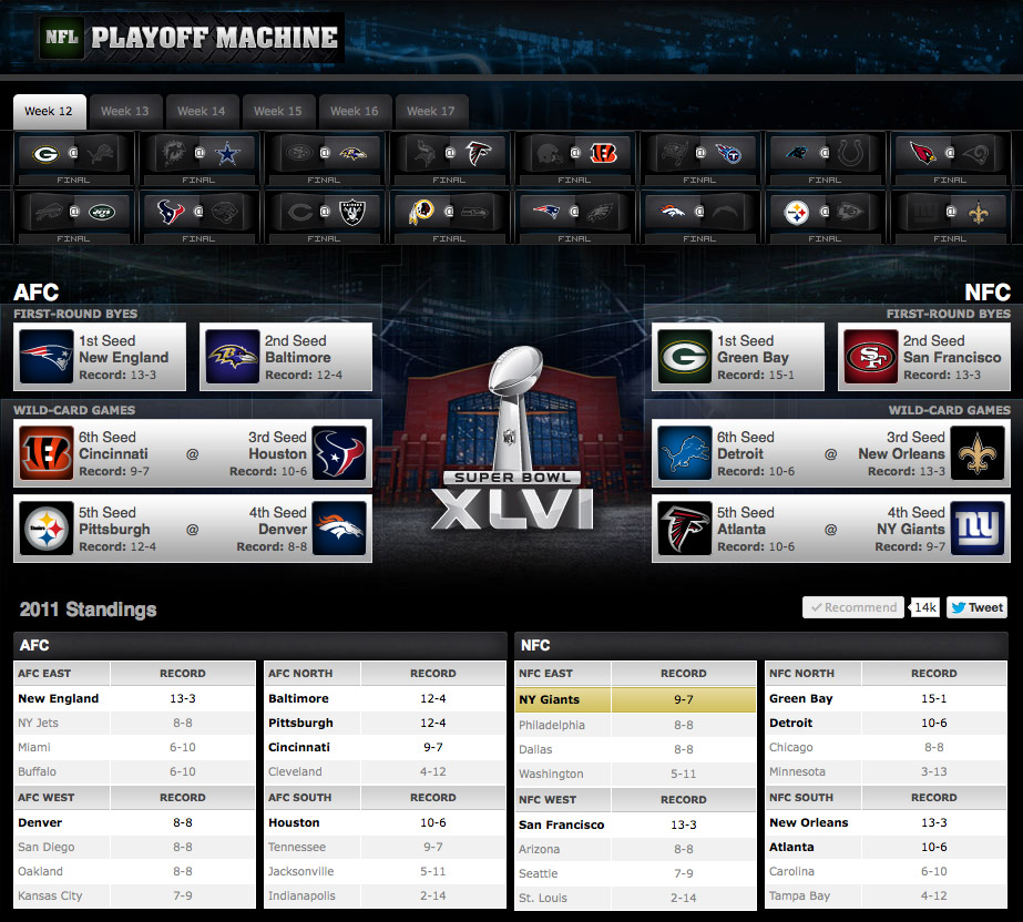
ESPN
Starting in week 12 of the NFL season, one can see what has to happen for his or her team to make the NFL playoffs. Instead of having to tediously write out every scenario possible , the playoff machine shows you who makes the playoffs when games go a certain way.
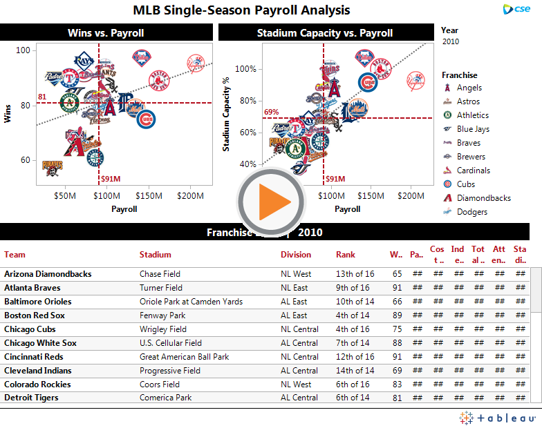
MLB Single-Season Payroll Analysis
Tableau Public
While this graphic may seem complicated and probably wouldn’t apply to anyone besides baseball fans, it is really fascinating (probably because i’m a baseball fan. This graphic compares every team’s payroll with its win total and stadium capacity for the 2010 MLB season.
http://business.time.com/2013/12/23/want-to-buy-a-home-better-bring-cash/
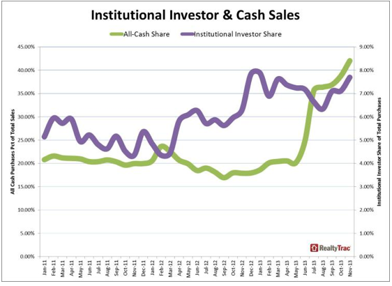
This was incredibly interesting to look at. I don’t plan to purchase a house right away, but as a senior in college, it is a distant concern of mine. I’ve heard of people purchasing cars with cash but not houses. I find it hard to believe that almost half of house-buyers last November paid in cash, but the chart above shows that its true.
http://www.theguardian.com/technology/2014/jan/13/smartphone-explosion-2014-india-us-china-firefoxos-android
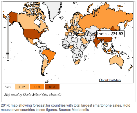
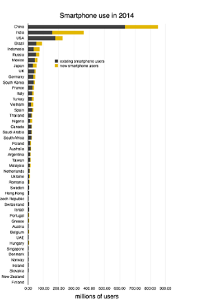
Smartphones are so common these days, especially among college students. This article caught my eye because the headline states that India will likely surpass the U.S. in smartphone use and ownership. There are some great charts revealing smartphone use all over the globe. I was surprised to see that China has already surpassed the U.S.
http://www.theguardian.com/news/datablog/2013/may/14/metadata-rise-of-data-web-search
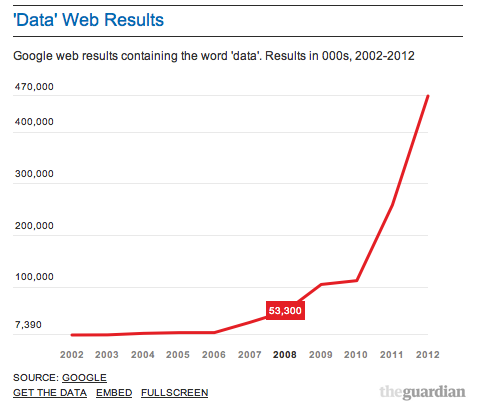
This article had some very fun, interactive charts. I could scroll over parts of the graph and see more details and tailor the data according to what exactly I was looking to find. This was also interesting because of the recent scare after the NSA revealed its access to cell phone data. Metadata is an extremely relevant issue right now.
CNN interactive map showing every person in the U.S. and Canada:
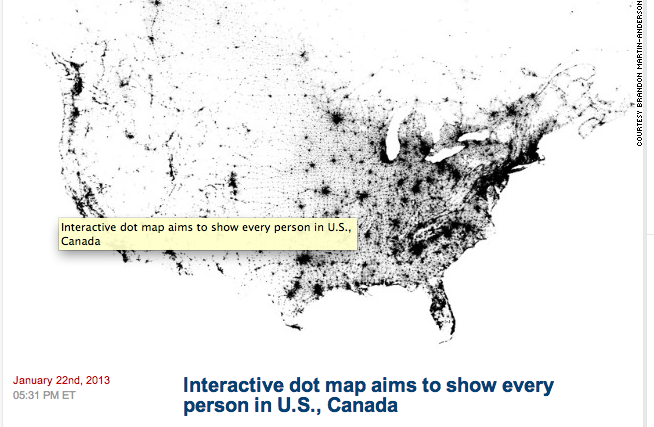
This story was particularly interesting to me because it is very interactive. Dating back to a year ago this coming week, this article represents each person in the U.S. and Canada by a black dot. It’s interesting to see the clutter of black dots in certain cities such as Washington D.C., New York City, and Los Angeles. It’s also fascinating to notice the distribution of the black clusters. For example compare the East Coast to the West Coast. The amount of white in the western part of America is quite different than the amount of black in the east. This interactive map though does not show descriptive roads or geographical locations so it might be hard to identify certain cities and states. This is not the first dot map yet it might be the first one to allot one dot per citizen.
http://whatsnext.blogs.cnn.com/2013/01/22/new-interactive-dot-map-aims-to-show-every-person-in-the-u-s/?iref=allsearch
New York Times interactive map about where poor and uninsured Americans live:
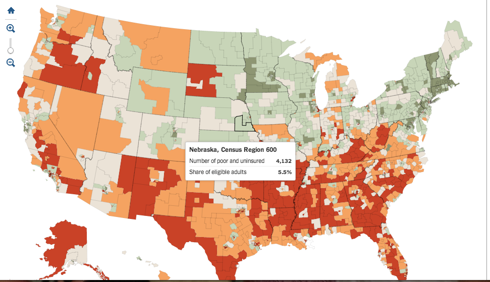
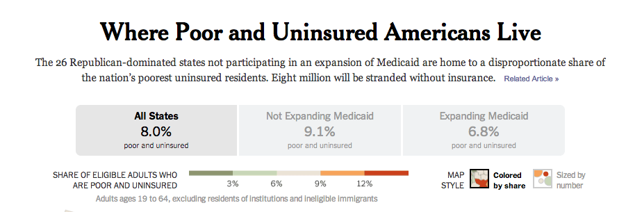
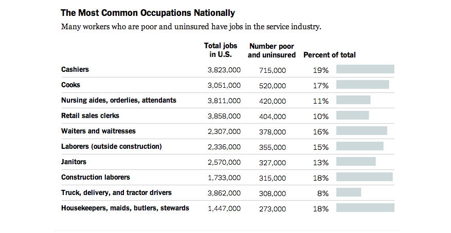
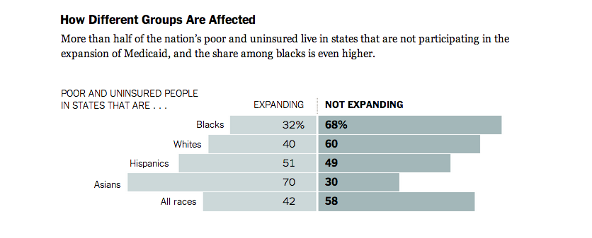
The article written in correspondence with this map is very interesting in the aspect of it gives you a different side of health coverage. Many people think they know what exactly health care is; who it covers and why it should or shouldn’t be approved. It’s fascinating to note in the interactive map you see the higher percentage of adults who are poor and uninsured in those places where Medicaid expansion is not being used. The data shows that cashier is the most common occupation with a staggering 19% unemployed. The astonishing part is the quote from Willie Charles Carter, an unemployed man in Mississippi who states “You got to be almost dead before you can get Medicaid in Mississippi.” This article gives a good details and has much data to show these statistics yet it is somewhat bias.
Gun Permit Holders in New York:
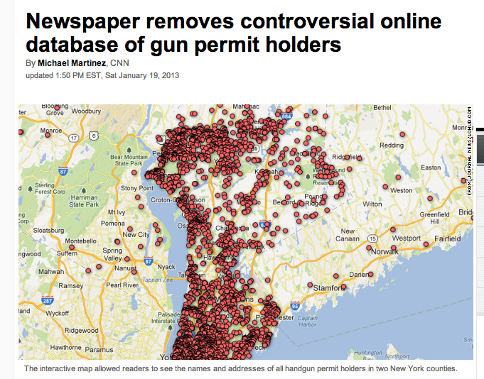
This interactive map shows the names and address of gun permit holders in two New York counties. It received many criticism from viewers and threats and thus the News Paper decided to take this map down. It shows if those who own gun permits have updated their licenses in the last 5 years by giving the representation of blue dots. Through the controversy the newspaper decided to keep a snapshot of the map on their website. This map came to be in the month after the devastating school shooting in Newtown, Connecticut. Is this map worth showing is a question brought up by readers.
http://www.cnn.com/2013/01/18/us/new-york-gun-permit-map/index.html?iref=allsearch
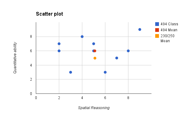
Our class in a few charts.
1) Here is a scatter plot of the results of the two quizzes you took on Thursday: the paper folding test (spatial reasoning) and the math quiz (quantitative ability). I made this scatterplot in Google Spreadsheets (part of Drive).
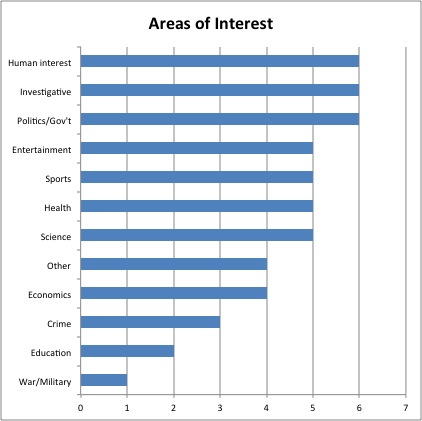
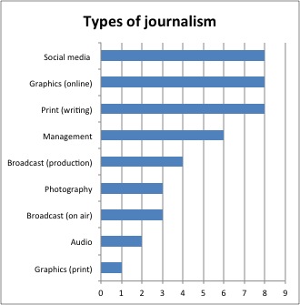
2) Next, we have the area of interests and types of journalism. For this, I used two simple bar charts. I made these in Excel.
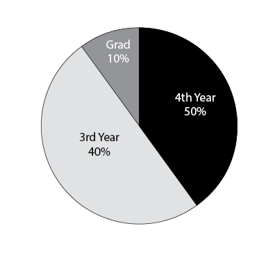
3) Finally, we end with a pie chart, breaking down the “year of school” item. I made this is Illustrator.
Explore the data: U.S. mass killings since 2006
USA Today
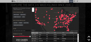
This is the definition of neat. USA Today grouped together the every mass killing — involving four or more being killed in one incident — and used the data to track trend locations, victim relations to the killer and how each victim was killed. Hearing a number like “232 mass killings since 2006″ doesn’t seem to carry as much impact as a graphical display of just how these murders took place. I was blown away by this.
In climbing the income ladder, location matters
David Leonhardt/New York Times
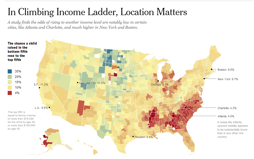
The New York Times published survey data in an interactive form that noted just how difficult it is to rise through income classes for residents in the Southeast. While a simple article noting the degree of difficulty is OK, the chart really breathes life into the data, helping us not only to understand the information put forth by the data but to make inferences on our own and to see the inequality for what it is instead of it being hidden among a bunch wordy text stories.
London Olympics 2012: How does each major team’s performance compare to Beijing 2008?
Garry Blight, Simon Rogers and Hilary Aked/The Guardian
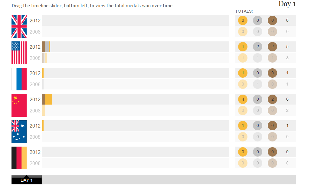
This is a relatively simple and clean bar chart from The Guardian but it illustrates context well. It’s hard to to a live-game comparison through text, but through a chart, our friends at The Guardian used the chart to track how the power countries were doing in the 2012 Olympics compared to the 2008 ones.