All posts by Zoe
Tennessee healthcare.gov enrollments meet national averages for age and gender
930,000 people or 15% of Tennesseans were uninsured in 2012. President Obama aimed to insure these individuals through the Affordable Care Act.
59,705 Tennesseans selected a marketplace plan in February. 70 percent of this number chose a silver plan, and 78 percent needed financial assistance in order to receive health care. This marks a threefold increase in November.
Affordable Healthcare Act fails to draw young people into the plan. The national average for coverage of the young adult age group (18-34) is 24 percent. This is low compared with the White House’s targeted 40 percent.
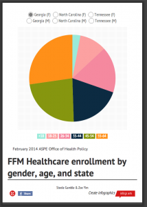
Tennessee met the national average for the young adult age group.
Females in Tennessee also held close to the national gender majority who signed up for insurance for both state and federally run insurance plans.
No individuals 65 and older chose plans in Tennessee. However, individuals in the 55-64 year olds were the largest percentage of individuals who chose enrollment with 33 percent.
In the age group categorizations, there was little differentiation of percentages in healthcare selection in Tennessee, North Carolina, and Georgia.
The Obama administration estimated that 2.7 million of 7 million individuals enrolling in coverage would be young adults. Covering this age category would promote a healthier population, whose premiums could subsidize the health care of older and less healthy individuals.
American young adults hesitate to sign up for healthcare shown by the low national average. Under penalty of higher taxes, Americans are mandated by law to have a plan.
Resistance occurs says Brendan Buck, a spokesman for House Speaker John Boehner, because a “one-size-fits-all plans that come with high costs for limited access to your doctor” is the only plan available after the law that cancelled the plan many Americans had, liked, and could afford.
Winter London Olympics Storyboarding
Feb. 13 assignment
Over 10,000 athletes from 208 countries competed in 44 different sports at the London Olympics.
In my storyboard, I decided to categorize athletes by age to see if there was a pattern.
Did age affect the way athletes performed or who decided to compete?![]()
![]()
![]()
Well, there was only one athlete in his seventies. At age 71, Hiroshi Hoketsu represented Japan in equestrian and was the oldest Olympian.
Perhaps, there’s a correlation. Bare with me. I understand that this seems obvious. The older you are, the worse your body performs. (Duh.)
In the 2012 London Olympics, there were only 31 individuals in the age category of Olympians 50 and above whereas in the 20-age group, there were 481 individuals.
As you can see, a chart would show that there is indeed a correlation between age and performance.
But what if we looked at a 13-year-old and a 18-year-old Olympian in the same sports category. Would experience and maturity in a sport cause better performance say in swimming?
This question would be answered in my data visualization.
Data Visualizations: What catches your eye
We consume information every day.
Oftentimes we take for granted people who sift through information so that the public can be informed and/or entertained.
Sometimes, data visualization tells a story more clearly than print.
So here are some data visualizations that caught my eye:
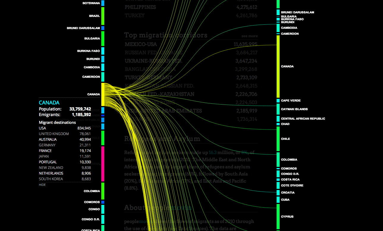
‘Peoplemovein is a visualization of migration around the world.
Both sides list a set of countries. Lines flow from one country depicting lines that increase in width as more people migrate from one country to their designated destination.
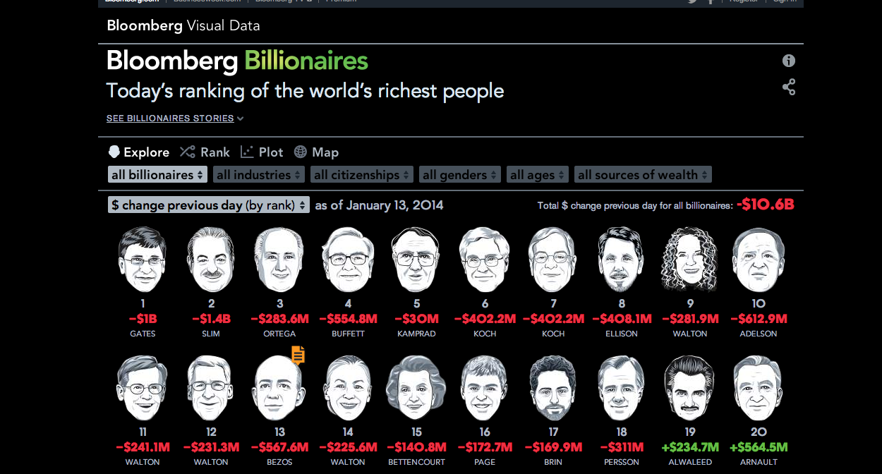
Bloomberg listed the richest people in the world with a caricature of their face and their net worth. A set of factors filter people by their industry, nationality, gender, age, and source of wealth.