We consume information every day.
Oftentimes we take for granted people who sift through information so that the public can be informed and/or entertained.
Sometimes, data visualization tells a story more clearly than print.
So here are some data visualizations that caught my eye:
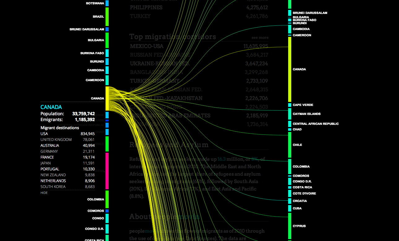
‘Peoplemovein is a visualization of migration around the world.
Both sides list a set of countries. Lines flow from one country depicting lines that increase in width as more people migrate from one country to their designated destination.
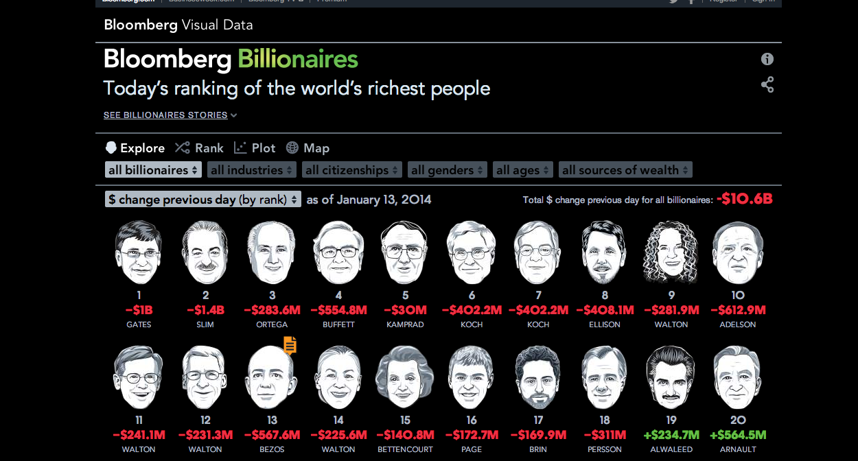
Bloomberg listed the richest people in the world with a caricature of their face and their net worth. A set of factors filter people by their industry, nationality, gender, age, and source of wealth.