Explore the data: U.S. mass killings since 2006
USA Today
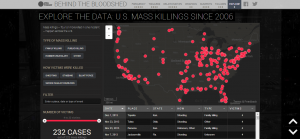
This is the definition of neat. USA Today grouped together the every mass killing — involving four or more being killed in one incident — and used the data to track trend locations, victim relations to the killer and how each victim was killed. Hearing a number like “232 mass killings since 2006″ doesn’t seem to carry as much impact as a graphical display of just how these murders took place. I was blown away by this.
In climbing the income ladder, location matters
David Leonhardt/New York Times
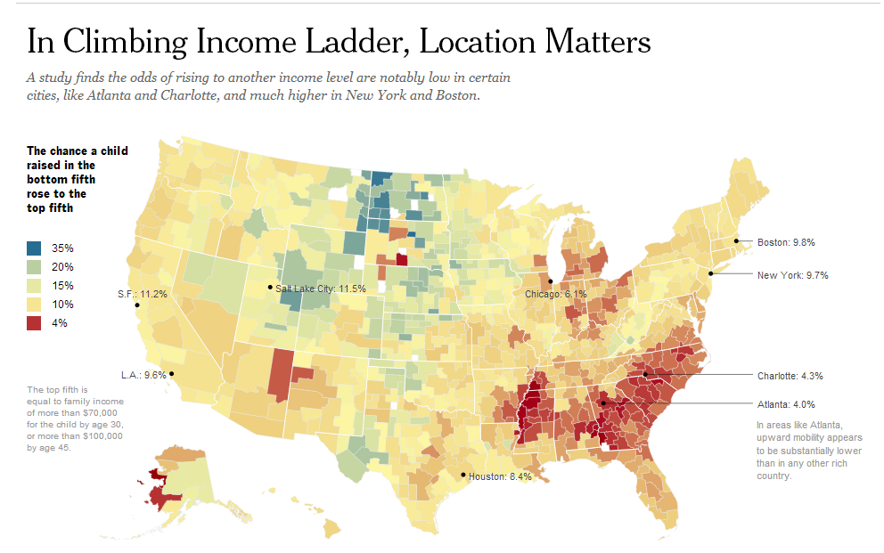
The New York Times published survey data in an interactive form that noted just how difficult it is to rise through income classes for residents in the Southeast. While a simple article noting the degree of difficulty is OK, the chart really breathes life into the data, helping us not only to understand the information put forth by the data but to make inferences on our own and to see the inequality for what it is instead of it being hidden among a bunch wordy text stories.
London Olympics 2012: How does each major team’s performance compare to Beijing 2008?
Garry Blight, Simon Rogers and Hilary Aked/The Guardian
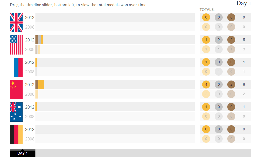
This is a relatively simple and clean bar chart from The Guardian but it illustrates context well. It’s hard to to a live-game comparison through text, but through a chart, our friends at The Guardian used the chart to track how the power countries were doing in the 2012 Olympics compared to the 2008 ones.