Our class in a few charts.
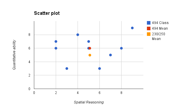
1) Here is a scatter plot of the results of the two quizzes you took on Thursday: the paper folding test (spatial reasoning) and the math quiz (quantitative ability). I made this scatterplot in Google Spreadsheets (part of Drive).
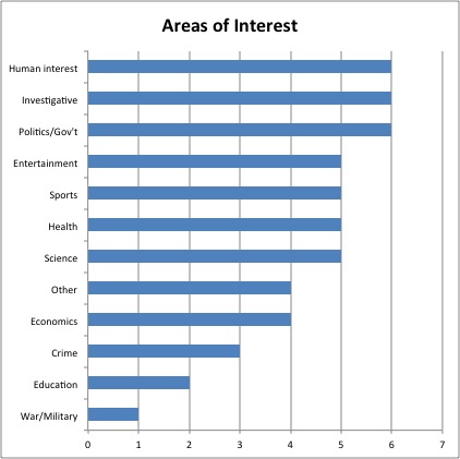
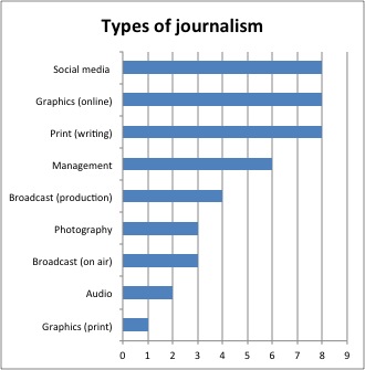
2) Next, we have the area of interests and types of journalism. For this, I used two simple bar charts. I made these in Excel.
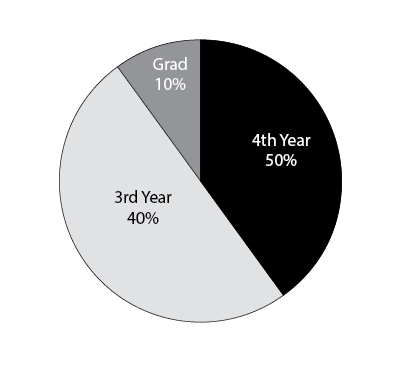
3) Finally, we end with a pie chart, breaking down the “year of school” item. I made this is Illustrator.