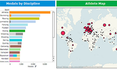
Olympics data: all our statistics, data journalism and visualizations in one place
Simon Rogers/The Guardian
Here is a unique way to display a very complex and large set of data. This graphic on the left shows the number of medals won in Olympic history, divided up by sport. On the right is the number of Olympic medals won broken down by each country.
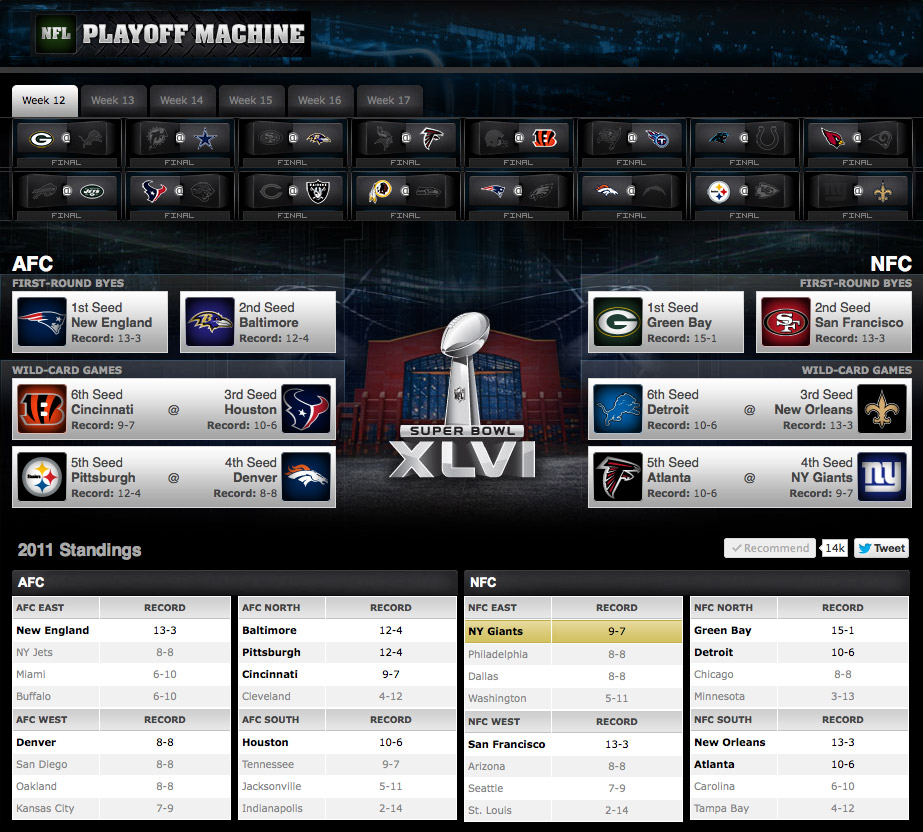
ESPN
Starting in week 12 of the NFL season, one can see what has to happen for his or her team to make the NFL playoffs. Instead of having to tediously write out every scenario possible , the playoff machine shows you who makes the playoffs when games go a certain way.
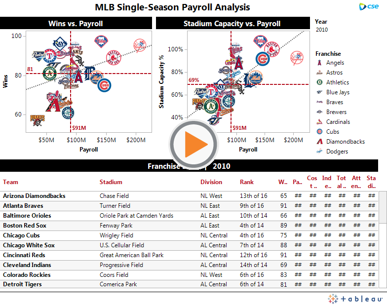
MLB Single-Season Payroll Analysis
Tableau Public
While this graphic may seem complicated and probably wouldn’t apply to anyone besides baseball fans, it is really fascinating (probably because i’m a baseball fan. This graphic compares every team’s payroll with its win total and stadium capacity for the 2010 MLB season.