We have learned to grab data, sort data, clean data and organize data. Now we need to learn how to display data. Today, we will intro all the technologies we will be using during the rest of the semester.
Step 1. Exploratory v. Explanatory
The first question we need to ask ourselves when making a data visualization is, “What kind of graphic am I making?” Although there are a lot of ways you can answer this question, I think the most important first step is to decide if you are making an exploratory or an explanatory graphic.
“Exploratory data visualizations are appropriate when you have a bunch of data and your not sure what’s in it.” – Iliinsky & Steele, p. 7
In exploratory graphics, the user is given the freedom to explore the data, but also has the responsibility of figuring out what the data means. This can be empowering, but overwhelming.
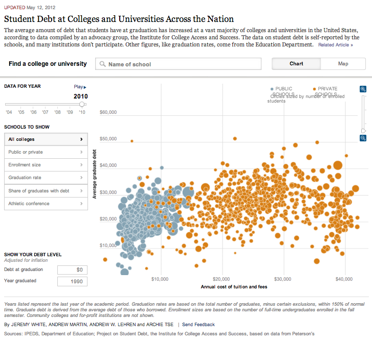
Let’s look at this example from the New York Times:
Unlike an exploratory graphic, an explanatory graphic is trying to tell a story, or point the reader to specific information. Most static graphics fall into the explanatory category. If we go back to my Peyton graphic, we can see how it was designed to explain something to the reader.
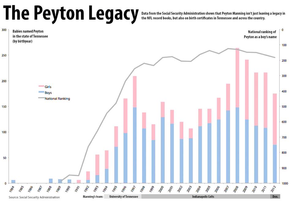
What was I trying to explain to the reader with this graphic? If you are making an explanatory, you need to decide exactly what concepts or ideas you want to explain to the reader. Then choose the most appropriate graphic type for that type of data.
Step 2. Data Type
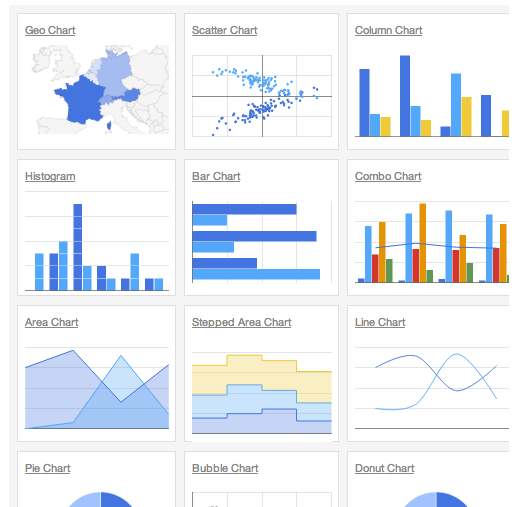
The type of data you have will determine the type of graphic/tool you use. Today, we will briefly discuss a number of different ways to display information. Then over the next few weeks, we will go more in-depth with each tool.
Is your data exploratory and type-less?
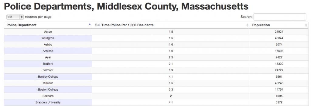
Do you have a lot of information, which falls into a number of different data types (e.g., numbers, dates, categories)? You might consider posting the data as a searchable database.
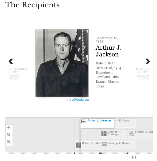
Does one of your columns include a date?
Maybe you should create a timeline.
Or we could create a bar chart…like my Peyton graphic. Remember the x axis of that graphic is time.
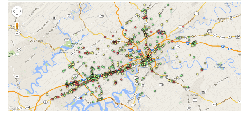
Does one of your columns include a location?
Maybe you should map the data. You could use Google Maps or something like StoryMap.js.
Are you just using numbers?
We probably want to use some kind of chart. Are you comparing numbers, looking at trends, looking at parts of a whole? AHHH…what are you trying to do? Once we decide that we can pick the correct chart to use.