The other day we looked at a graphic from the Washington Post about the missing plane. If you remember correctly, I didn’t like.
Here is another piece of data journalism related to the missing plane:
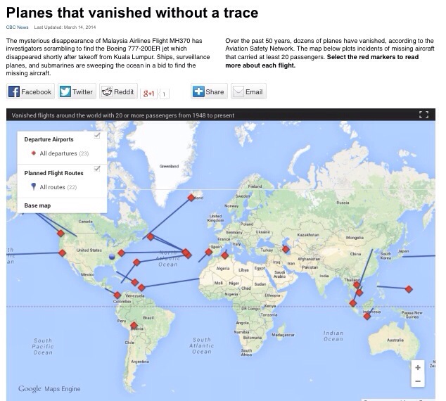
I like this one. It is so simple – a Google Map with a few handfuls of data points – but it gives the user a lot of new information. Fantastic.