D3 (or Data-Driven Documents) is an open-source JavaScript library for making data visualizations. Pretty cool, eh?
Oh…you’re asking yourself, “what is an open-source JavaScript library?” Well, the first part, open source, means that the source code is publicly available. In many cases, open-source software can be freely downloaded, edited and re-published. For more information about open-source software, check out this annotated guide.
The second part, javascript library, means that it is a collection of JavaScript functions that you can reference in your code. Basically, it is a bunch of code that other people wrote so you don’t have to! All you have to do is point to the library and tell it what you want to do.
Pointing to the library is easy. You just use the <script> tag and tell the browser what script you want. Generally, you can either host the library on your server or point to the library on the creators server. If you point to their server, you’ll automatically get updates (depending on their naming/workflow), which is good and bad. It is good in that you are using the newest software. It is bad in that they might update something in a way that ruins your project. I personally lean toward hosting on my server.
To host on your server:
- Download the library from the D3 website.
- Upload the library to your server
- Point to the library using the following code:
<script src="/d3/d3.v3.min.js" charset="utf-8"></script>To leave it on their server:
- Just insert this code:
<script src="http://d3js.org/d3.v3.min.js" charset="utf-8"></script>We have successfully navigated step one. Our browser will know that it needs to use JavaScript, because of the <script> tag, and it will load the correct JavaScript library, because we told it where the library is by using the src attribute.
Now we can move to step 2. Actually making a graphic using the library. To do this, we can just put directions in between the opening and closing <script> tags (which sounds easy).
The first thing we have to understand about D3 is that we are using code to create everything in the chart. This is amazing, because it is highly adaptable and lightweight. This is also a drawback, because that means that there is a steep learning curve and can be a bit daunting at the beginning. Let’s start by looking at a chart and backing it down to it’s elements.
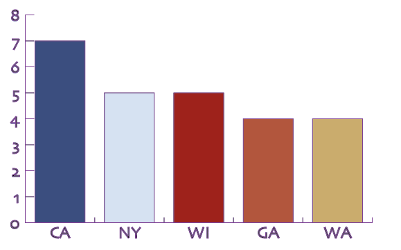
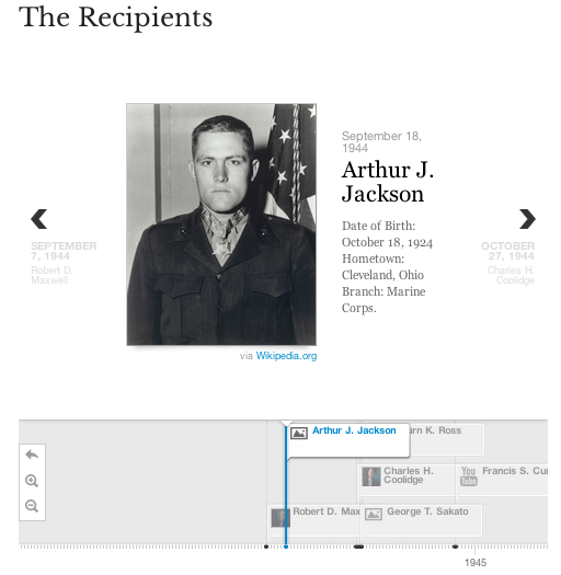
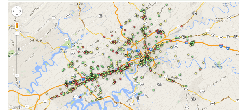
Medal of Honor recipient origin: Top 5 states
What do we need to create this graphic?
- Data
- Type of chart
- Axes and labels
- Color coding
We are going to need to explain that all to D3.
First, lets deal with the data. You can get data to D3 in numerous ways. For now we will enter the numbers in an array and assign it to a variable. You can also point D3 to CSV files, JSON data, and numerous other file types. I haven’t looked but I assume you could point to a Google Spreadsheet. Regardless, here is the snippet of code we’ll use to encode our data:
var dataset = [ 12, 15, 20, 24, 25, 18, 27, 29];
This code should makes sense. We are creating a variable (var) named dataset and we are assigning our values to it.
Now we need to decide the way in which we want to display the data. For now, we will create a simple bar chart. So we need to style a bar. To do this we are going to use CSS (cascading style sheets), which we discussed a few weeks ago. We are going to assign the style to a DIV tag. We’ll add the class “bar,” so it isn’t applied to all DIVs on our page. Here is the snippet of code:
div.bar {
 display: inline-block;
 width: 20px;
 height: 75px;
 margin-right: 2px;
 background-color: teal;
 }
This will make the default bar 20px wide, teal, and with a 2px margin. Right now, the bar is 75px tall, but we will adjust that based on our data.
Finally, we need tell our browser that we want to use D3 to use this style to draw a bunch of bars representing our data. Here is the code we’ll use to do that:
 d3.select("body").selectAll("div")
 .data(dataset)
 .enter()
 .append("div")
 .attr("class", "bar")
 .style("height", function(d) {
 var barHeight = d * 5;
 return barHeight + "px";
 });
OK…this snippet of code looks a lot more confusing. In English, this code says, “Append each item in our dataset to a div of the class bar and adjust the height of the bar based on its value.”
One of the coolest things about D3 is using the built-in “d” variable to cycle through all the values in a dataset. In our case, D3 pulls up each value then multiples it by 5 and assigns that value to the height of the bar it is drawing.
Now we have all the building blocks for a basic bar chart. We can organize it in an HTML as follows:
<html lang="en">
 <head>
 <meta charset="utf-8">
 <title>D3 Demo: Making a bar chart with divs</title>
 <script type="text/javascript" src="../d3/d3.v2.js"></script>
 <style type="text/css">

 div.bar {
 display: inline-block;
 width: 20px;
 height: 75px;
 margin-right: 2px;
 background-color: teal;
 }

 </style>
 </head>
 <body>
 <script type="text/javascript">
var dataset = [ 12, 15, 20, 24, 25, 18, 27, 29 ];

 d3.select("body").selectAll("div")
 .data(dataset)
 .enter()
 .append("div")
 .attr("class", "bar")
 .style("height", function(d) {
 var barHeight = d * 5;
 return barHeight + "px";
 });

 </script>
 </body>
</html>
If we uploaded that file, we would get the following chart:

Maybe it isn’t the most beautiful chart, but it is all code…no JPGs, no Google Charts…just code.
ED NOTE: I am not sure how long this will take in class, so I am skipping ahead to updating the dataset. I will come back to axes and labels.
A code-driven chart is cool, but an interactive chart is even cooler. So let’s do that.
What we’ll have to do is add an object with which the user can interact (i.e., click). Then we’ll have to add code that tells D3 to listen for a click and update the data when it hears it. For the object, we’ll just create a simple set of text using the <p> tag. Here is the code we’ll use:
<p> Conference standing </p>
Now we need to add the Event Listener and tell it to update the data. Here is the code:
d3.select("p")
 .on("click", function() {

//New values for dataset

dataset = [ 7, 3, 4, 2, 2, 3, 2, 1 ];

//Update all bars
d3.selectAll("div")
  .data(dataset)
  .style("height", function(d) {
      var barHeight = d * 5;
      return barHeight + "px";
  });
});
Although this looks complex, we can easily walk through it. We are telling the browser to listen for any clicks within a <p> tag. Then once it hears the click, it executes the function. Within the function, the dataset is updated with our new data and the bars are redrawn.
You can see the fruits of our labor here.
Pretty cool, but pretty useless. Am I right?
We can easily make this better by adding an IF command to our Event Listener. You should remember IF commands from some of our work in Excel. But basically an IF command says:
IF (logical statement comes back true) {
     Do this
}
ELSE {
     Do this
}
We can start this process by giving our user two interaction options, like so:
 <p id="wins">Wins per year</p>
 <p id="conf">Conference</p>
We do the same thing as early – use the <p> tag – but this time we add unique id’s that we can reference later.
Then we just add the IF command to our Event Listener:
d3.selectAll("p")
 .on("click", function() {

 //See which p was clicked
 var paragraphID = d3.select(this).attr("id");

 //Decide what to do
 if (paragraphID == "wins") {
   //New values for dataset
   dataset = [ 12, 15, 20, 24, 25, 18, 27, 29 ];
   //Update all bars
   d3.selectAll("div")
     .data(dataset)
     .style("height", function(d) {
        var barHeight = d * 5;
        return barHeight + "px";
     });
 } else {
   //New values for dataset
   dataset = [ 7, 3, 4, 2, 2, 3, 2, 1 ];
   //Update all bars
   d3.selectAll("div")
     .data(dataset)
     .style("height", function(d) {
        var barHeight = d * 5;
        return barHeight + "px";
      });
   }
 });
All that we added was two options. If the user clicks wins, we keep with the original dataset, and when the user clicks conference we insert the new dataset.
You can see the chart here.
And you can find the code on GitHub: https://github.com/ngeidner/d3_example