All posts by nick

Finding Data

As you read, there are many ways data journalists end up finding data. It can be through existing databases or through good ol’ fashioned shoe leather reporting. Today we’ll play with a couple tools for making the search for data a bit easier.

Screen Shot 2014-01-28 at 12.10.39 PM


First up is Census Reporter. This Knight News Challenge funded project is an amazingly, simple source for local census data. Let’s say we want to find median household income by census track in Knox County. Usually, this would involve digging through the information provided via Census.gov (which is decently well-organized, but not the easiest to work with). With CensusReporter you just answer three questions in the “compare places” tool.

Screen Shot 2014-01-28 at 12.32.06 PM

We’ll find that data now.

Screen Shot 2014-01-28 at 1.40.56 PM

Next, we’ll look at Data.gov, the U.S. government’s data repository. This should be a starting point for searching for any data, which could be at all related to the federal government.

Let’s take some time to find a piece of data from the repository about University of Tennessee.

When you are looking locally it is a bit more hodge podge. Let’s try to look up some information and think about how we could collect that information.

What kind of information might we want to look up locally? Here are a couple examples:

1) Property tax? Start with the public records online directory.

Screen Shot 2014-01-28 at 2.09.15 PM


2) Meth labs? Try the Tenn Meth Task Force.

Screen Shot 2014-01-28 at 2.08.45 PM


Fun with Maps

Who said mapping can’t be fun? Here are two examples of fun mapping projects.

The first one, NukeMap, lets you “create” a nuclear explosion anywhere in the world to see how large the fallout would be. The user can adjust the location, the size of the bomb, and a handful of other variables.

Screen Shot 2014-01-23 at 11.36.05 AM


The second, BBC’s “How Big Really?”, is similar. It lets users see the relative size of important places, events and things (e.g., environmental disasters, the Mars rover path) by placing the footprint of the object on a more familiar area. For example, the map below shows the footprint of St. Peter’s Basilica at the Vatican placed in the middle of UT’s campus.

Screen Shot 2014-01-27 at 1.06.59 PM

overwhelmed

How can I do this?

After looking at a bunch of example and reading about how people have done data journalism projects, you might be overwhelmed.

But don’t be!

Data journalism is storytelling, just like every other journalism you have done.

1) You start by identifying a story. The only difference is that we are looking for a particular type of story. We are looking for stories that are information/data heavy.

2) Once we have a story, we need to do the reporting for the story. For a print or video story, we would probably go out an interview sources. For data journalism, we want to find the appropriate dataset. There are three ways you might do this:

  • Find the perfect machine readable dataset
  • Find a data, which you can make machine readable
  • Create a dataset

3) Once you have completed your reporting, you move to organizing the information. For print, you might transcribe an interview and read through it, pulling out the best quotes. For data journalism, you need to clean, sort, and analyze your data.

4) Next, you move on to organizing your story. In what way will you use the information you found? In this class, we will storyboard our project.

5) Finally, we will create the story, database, visualization, etc.

Through out the class, we will go through each step of this process. We will make sure that each group is on the right page at each step of the process.


Entry survey results

Our class in a few charts.

1) Here is a scatter plot of the results of the two quizzes you took on Thursday: the paper folding test (spatial reasoning) and the math quiz (quantitative ability). I made this scatterplot in Google Spreadsheets (part of Drive).

chart_1

2) Next, we have the area of interests and types of journalism. For this, I used two simple bar charts. I made these in Excel.

494_interest

 *The “others” include: international affairs, narrative video journalism, and technology

494_type


3) Finally, we end with a pie chart, breaking down the “year of school” item. I made this is Illustrator.

Screen shot 2014-01-14 at 11.35.33 AM


map

My inspiration and semester-long projects

I have been interested in multimedia journalism for my whole career, but I really got into data journalism and data visualization in the last few years. There were two projects that came out of the New York Times‘ data visualization lab around 2009-2010 that really inspired me to learn more about data journalism: the Budget Puzzle and Unemployment for People Like You.

Both projects give the reader a different view of a generic numbers stories (i.e., federal budget deficit and unemployment rate). They add context and nuance that traditional journalism (e.g., print or television) can’t give. They also allow the user to explore the information and come to his or her own understanding of the existing data. This type of self discovery can be a very powerful tool in teaching the reader about a complex topic, like variance in the unemployment rate.

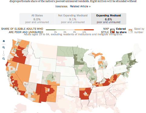
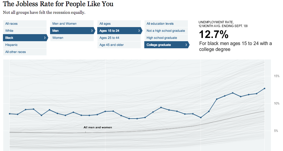
The jobless rate app (below) uses unemployment data from the Bureau of Labor Statistics (which is a great data source). In most news stories, the unemployment rate is treated like a single number across the population. The simple interactive graphic the New York Times created gets beyond the single number and lets the user see that the unemployment rate is not evenly distributed across the population.

Unemployment_people_like_me


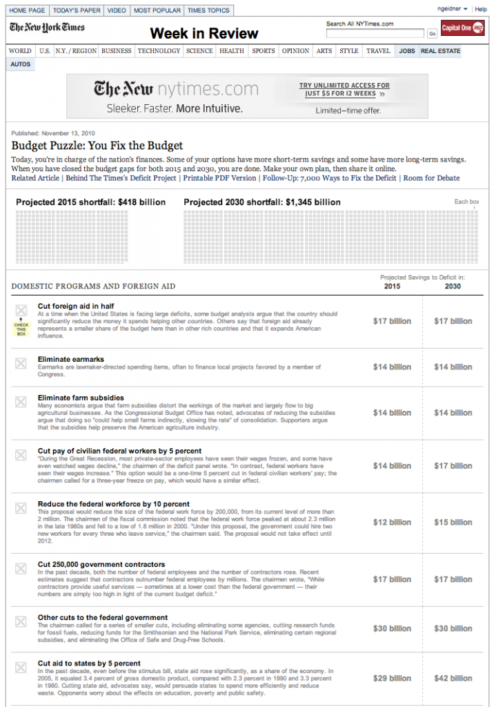
The Budget Puzzle is similar to the unemployment graphic in that it provides nuance to a number we hear all the time, but probably don’t understand. Unlike the unemployment graphic, the Budget Puzzle is framed to be a game. The user is charged with the task of balancing the budget.

The Budget Puzzle was widely popular. In its first week online, it received over one million page views and over 11,000 people posted messages on Twitter about the puzzle or their solution to the puzzle. In my opinion, this graphic, more than any other piece journalism, demonstrates the complexity and near impossibility of balancing the federal budget.

budgetpuzzle


These graphics made me interested in data journalism, but they are not the ones that are inspiring the projects I am going to work on this semester.

Current inspiration

My first project is inspired by two pieces of data journalism. First, the Knox News‘s weekly “Top 5, Bottom 5″ blurb. Every week, the Knox News publishes the scores of the top five and bottom five restaurant health inspection reports. My wife and I both love looking at it. I have no clue why, but we just love it.

The only problem is that I always say to myself, “Why only 10? I want to see them all!” So I have decided to map the most recent, routine health inspection for every restaurant, eatery and bar in Knoxville.

Although, the Knox News provided me with story inspiration, I still needed design inspiration. For that, I turned to the tried and true New York Times. I knew I wanted to do a map, so I started Googling around for “New York Times interactive maps.” After a while, I found the perfect inspiration.

map


You can see the draft for my project here. Through out the semester, we will learn how to do everything in this project.

My second project will be tied to the Medal of Honor Project. Specifically, I want to make a better website for people looking for information about Medal of Honor recipients. The current database run by the Congressional Medal of Honor Society has a lot of information, but is not the most exciting or user friendly.

Again, I knew what I wanted to do, but I couldn’t picture how to organize everything. I put the project on the back burner and figured I would eventually come up with an idea. That plan worked. I stumbled across an amazing project from the Austin Statesman.

The Austin Homicide Project is similar to Homicide Watch D.C.  and aims to document every homicide in Austin, Texas. Their website includes a lot of information about a lot of people and displays in numerous ways (e.g., searchable databases, charts, and maps), just like I need for the Medal of Honor Project. Make sure to check out this site. It is very impressive journalism. 

homicide

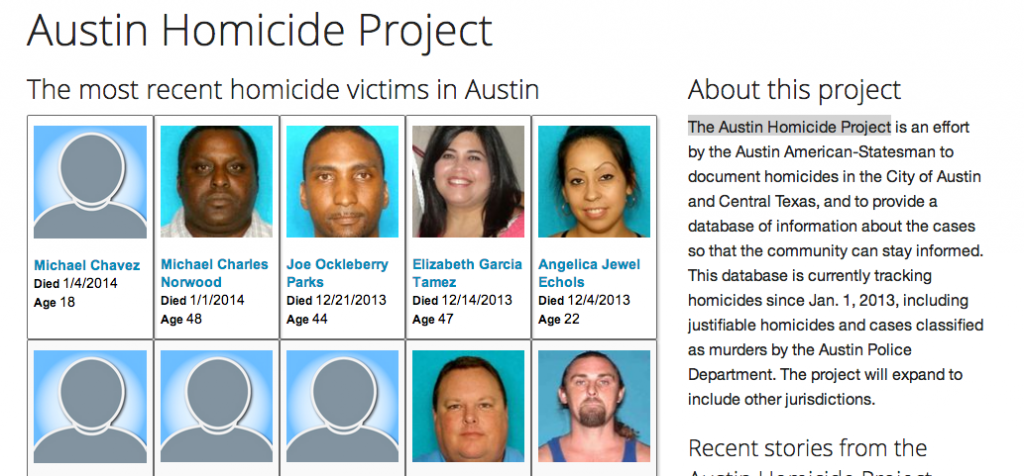
I haven’t started working on this project yet, but I think the Austin Homicide Project will give me the design and organizational inspiration to get started. As I work on it, I will include updates on the blog and discuss it in class. We will also use some of the data in class for examples.