I have been interested in multimedia journalism for my whole career, but I really got into data journalism and data visualization in the last few years. There were two projects that came out of the New York Times‘ data visualization lab around 2009-2010 that really inspired me to learn more about data journalism: the Budget Puzzle and Unemployment for People Like You.
Both projects give the reader a different view of a generic numbers stories (i.e., federal budget deficit and unemployment rate). They add context and nuance that traditional journalism (e.g., print or television) can’t give. They also allow the user to explore the information and come to his or her own understanding of the existing data. This type of self discovery can be a very powerful tool in teaching the reader about a complex topic, like variance in the unemployment rate.
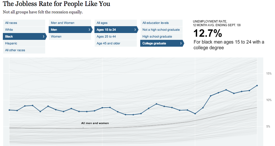
The jobless rate app (below) uses unemployment data from the Bureau of Labor Statistics (which is a great data source). In most news stories, the unemployment rate is treated like a single number across the population. The simple interactive graphic the New York Times created gets beyond the single number and lets the user see that the unemployment rate is not evenly distributed across the population.

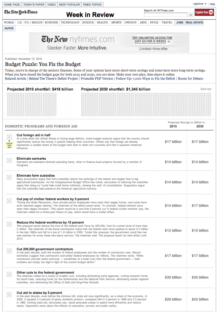
The Budget Puzzle is similar to the unemployment graphic in that it provides nuance to a number we hear all the time, but probably don’t understand. Unlike the unemployment graphic, the Budget Puzzle is framed to be a game. The user is charged with the task of balancing the budget.
The Budget Puzzle was widely popular. In its first week online, it received over one million page views and over 11,000 people posted messages on Twitter about the puzzle or their solution to the puzzle. In my opinion, this graphic, more than any other piece journalism, demonstrates the complexity and near impossibility of balancing the federal budget.

These graphics made me interested in data journalism, but they are not the ones that are inspiring the projects I am going to work on this semester.
Current inspiration
My first project is inspired by two pieces of data journalism. First, the Knox News‘s weekly “Top 5, Bottom 5″ blurb. Every week, the Knox News publishes the scores of the top five and bottom five restaurant health inspection reports. My wife and I both love looking at it. I have no clue why, but we just love it.
The only problem is that I always say to myself, “Why only 10? I want to see them all!” So I have decided to map the most recent, routine health inspection for every restaurant, eatery and bar in Knoxville.
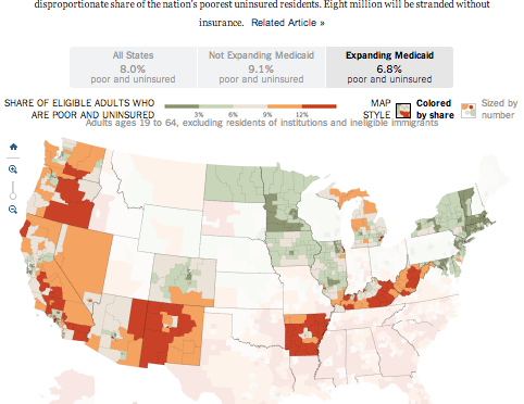
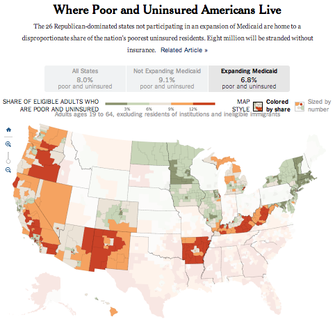
Although, the Knox News provided me with story inspiration, I still needed design inspiration. For that, I turned to the tried and true New York Times. I knew I wanted to do a map, so I started Googling around for “New York Times interactive maps.” After a while, I found the perfect inspiration.

You can see the draft for my project here. Through out the semester, we will learn how to do everything in this project.
My second project will be tied to the Medal of Honor Project. Specifically, I want to make a better website for people looking for information about Medal of Honor recipients. The current database run by the Congressional Medal of Honor Society has a lot of information, but is not the most exciting or user friendly.
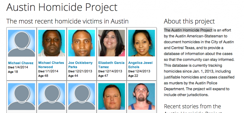
Again, I knew what I wanted to do, but I couldn’t picture how to organize everything. I put the project on the back burner and figured I would eventually come up with an idea. That plan worked. I stumbled across an amazing project from the Austin Statesman.
The Austin Homicide Project is similar to Homicide Watch D.C. and aims to document every homicide in Austin, Texas. Their website includes a lot of information about a lot of people and displays in numerous ways (e.g., searchable databases, charts, and maps), just like I need for the Medal of Honor Project. Make sure to check out this site. It is very impressive journalism.

I haven’t started working on this project yet, but I think the Austin Homicide Project will give me the design and organizational inspiration to get started. As I work on it, I will include updates on the blog and discuss it in class. We will also use some of the data in class for examples.

