Feb. 13 Assignment

Average height for 2012 Summer Olympian , 5 feet 9 inches tall

Find out the average height by filtering through sport.

In the 2012 Summer Olympics in London, hosted  10, 385 athletes from 208 countries competing for gold in 44 sports.  Gymnastics had the shortest average height of about 5 feet 3 inches. Basketball had the tallest average height of about 6 feet 3 inches.  The overall average height for all 44 sports was about 5 feet 9 inches.

Writing with data – Takeaways

Across the two readings for today, there were a number of important points that we should think about anytime we are writing from data.

1) What is the quality of your data? The sources and methods we use to collect data can lead to incorrect assumptions about the true state of the variables of interest. The best thing we can do to deal with this problem is to ignore the cliche “numbers don’t lie.” Numbers can lie just as easily as any source we deal with in journalism. The people who create or compile the data might have a vested interest in the results of the data or they might just be big dummies. Alternatively, if you are collecting the data you might not understand the variables you are interested in well enough to be able to find all the relevant information.

2) Correlation is not causation. Just because two variables are related, doesn’t mean that their is a causal relationship between those variables. The best way to deal with this problem is to be skeptical of yourself and your reporting. Is there any reasonable alternative explanation for the causal relationship you are looking at? Are you sure the relationship goes in the direction you think it goes?

3) Do your results generalize? Generalization refers to the ability for your results to replicate to other groups. Anytime we are looking at data that is less than a population or census, we need to be concerned about whether our results accurately reflect the variables/relationships of interest. Looking at the restaurant inspection data, we can easily see how lack of generalizability can be a problem.

If I called the health department and pull data for January through March of 2013, I would believe the health department does about 28 routine inspections a month or about 330 per year. As we know they actually did more than 1500 in 2013. The sample that we chose (i.e., Jan – March) was not representative of the rest of the year.

4) Statistical significance.  If we find a relationship between two variables, we must ask ourselves, “Does the strength of this relationship rise above that of chance?” Tests of statistical significance answer just that question. Which is great, but also limiting. Above chance is not a high bar to pass, so beyond just being concerned about significance we should also be concerned with the strength of the effect. This can be addressed via measures of effect size, which can be calculated using most statistic programs.

5) Am I providing the proper context for the number I am reporting? A quote taken out of context can completely change the meaning/intention of the source. The same is true of numbers. If we do not provide the reader with the proper context to interpret the meaning of a statistic, he or she is left to guess the importance.

Adding to class discussion

Here are a couple things that add to our class discussion from Thursday.

First, @AdBaum, a Ball State journalism graphics student, posted his storyboards for a graphic he created as part of @BSUattheGames.

Bf9wTP8IgAACrHg


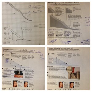
It is a great example of the way the design process works: start with a simple design, move to prototyping, edit, edit more, finish.

The second thing is related to the data plan/story update of Steele and Zoe. If you remember they want to do something about the minimum wage, and they were thinking about linking it to poverty. I told them to try that, but also I suggested they might want to look for something smaller that might be more directly affected by variation in the minimum wage.

Poverty is a complex concept and is influence by a number of variables. Raising the minimum wage could definitely result in a change in the poverty rate, but it is hard to parse out the effect of raising the minimum wage from the effects of the other variables.

Screen Shot 2014-02-08 at 12.13.27 PM


For example, if minimum wage goes up and a second variable goes down, we would see no difference in the poverty rate.  If the number of the variables affecting poverty isn’t just three (like above), but is 100′s it would be nearly impossible to see the the unique effect of any single variable. Therefore, we need to see if we can find an outcome variable, which is more directly related to raising the minimum wage.

Screen Shot 2014-02-08 at 11.59.41 AM

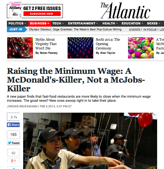
The Atlantic published a story on Thursday that did exactly this. Their article, based on a piece of academic research, argues that raising the minimum wage results in cheap fast food restaurants, such as McDonalds, closing and being replaced by more expensive fast food restaurants, like Five Guys. The article explains:

All of this raises an interesting question: Why would more fast-food spots suddenly start opening right after wages rise? The study’s theory, essentially, is that it’s tough to teach an old McDonald’s new management tricks. Brand new restaurants can be flexible about their business model. But once set, that model can be hard to revamp. So if management is used to paying its cashiers and fry cooks $7.25 an hour, it might never figure out how to clear a profit while paying them $9. A new burger joint, on the other hand, can set itself up to earn money immediately (and take advantage of the hole in the market left by the failed competition).

This article is a great example of two things. First, it show us how we should look for smaller, micro-level effects of policy changes. Second, it shows how to use academic research to discuss social problems. We could easily turn this into more of a “data journalism” story (i.e., something that could fulfill the requirements of this class) by visualizing the academic researchers’ results.

Storyboarding

A dataset doesn’t just turn itself into a story. It takes a lot of forethought and organization to make a graphic or multimedia story. One of the most common ways to start organizing a story is to storyboard. Storyboarding involving quickly sketching out the ideal end product.

Through out the design process you will more than likely go through multiple rounds of storyboards. The first might be a very generic layout of the page, pulling together and defining the content you are going to want.

photo (3)In this first storyboard, I defined what I wanted (a map, navigation, and a text area). I then went out to collect and started creating the content. After I collected the content and started looking at the data my story changed a bit and I created a new storyboard.

photo (5)

photo (4)

Again I have identified all my content and gave myself an idea of how everything should be put together. I can then move into building each element and pulling it together in the web presentation.

Today we will start thinking visually by creating a storyboard. We are working for the KnoxNews and they have asked us to create a graphic about the athletes in the Olympics (unfortunately we will be using data from the 2012 London Olympics). The information that we have is from the IOC media guide. Come up with ideas for graphics you would like to create and sketch them out on the notecard I provided.

You can find the data here.

Bringing it all together

Over the last few days, we’ve read a lot about Microsoft Excel and Google Refine. Today we will use that knowledge to clean a dataset and create a simple frequency table.

The data comes from the UT Police Department. I called the public information officer – at the time it was Emily Simerly – and requested a report of every instance in which a campus blue phone used. They gave me the data in the following PDF:

University of Tennessee Blue Phone Incidents 2009

PDFs are the pits. Seriously, avoid PDFs like the plague. I was young and stupid when I requested this data and didn’t ask them if I could get it in a different file format (e.g., csv, excel, ect.). The only good thing about this PDF is that it is a PDF with embedded text as opposed to a image-based PDF (where the whole page is essentially just one big image). If the PDF you are using is image-based, getting the data out is fairly complicated (see this guide by ProPublica).

Because my PDFs included embedded text, I was able to use a third-party application to convert the PDF to an Excel file. Again, ProPublica has a guide for this. Also, the Journalism in the Americas project at University of Texas-Austin has a good list of third-party apps for pulling data from PDFs.

Screen Shot 2014-02-04 at 1.53.03 PM

I ended up using Cometdocs, because it was the first one I tried. I simply uploaded the PDF, and they emailed me an Excel file. As you can see, it worked, but it isn’t the prettiest data set.

Screen Shot 2014-02-04 at 1.56.46 PM

Now that we have an Excel based dataset, we can start playing with the data. Your assignment for today is to create a simple table that lists the number of incidents at each blue phone during 2009.

You can download the Excel dataset here (if you have problems downloading try right-mouse clicking and choosing “Save file as…”).

Hint: You will have to use both Excel and Refine. Refine has been installed on all the computers in the lab.