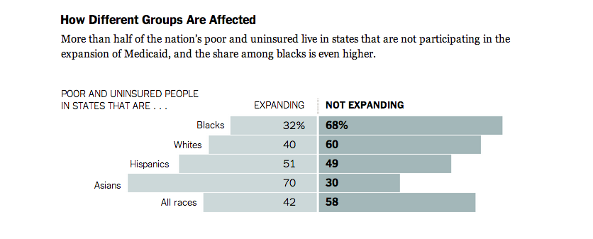
Over the last few days, we’ve read a lot about Microsoft Excel and Google Refine. Today we will use that knowledge to clean a dataset and create a simple frequency table.
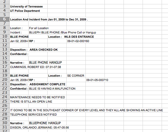
The data comes from the UT Police Department. I called the public information officer – at the time it was Emily Simerly – and requested a report of every instance in which a campus blue phone used. They gave me the data in the following PDF:
University of Tennessee Blue Phone Incidents 2009
PDFs are the pits. Seriously, avoid PDFs like the plague. I was young and stupid when I requested this data and didn’t ask them if I could get it in a different file format (e.g., csv, excel, ect.). The only good thing about this PDF is that it is a PDF with embedded text as opposed to a image-based PDF (where the whole page is essentially just one big image). If the PDF you are using is image-based, getting the data out is fairly complicated (see this guide by ProPublica).
Because my PDFs included embedded text, I was able to use a third-party application to convert the PDF to an Excel file. Again, ProPublica has a guide for this. Also, the Journalism in the Americas project at University of Texas-Austin has a good list of third-party apps for pulling data from PDFs.
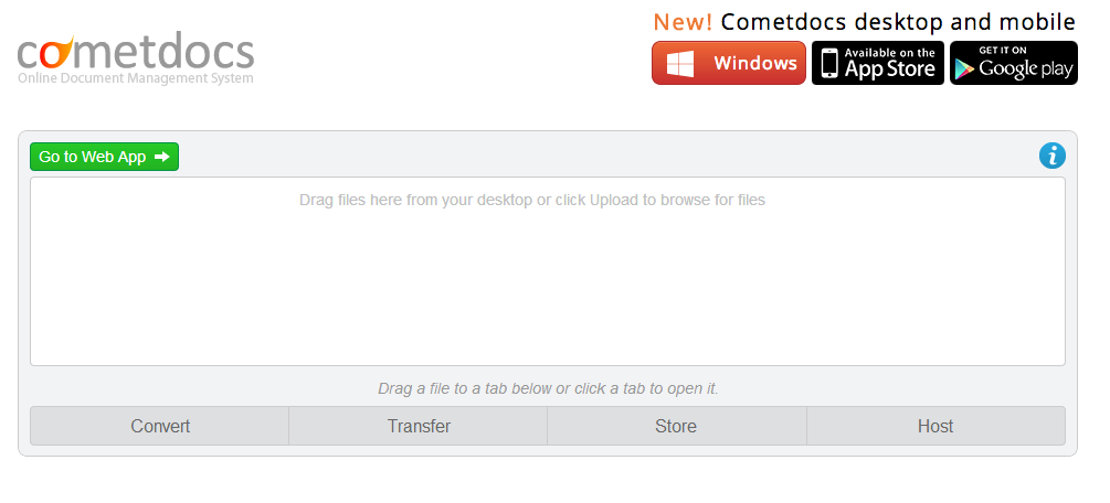
I ended up using Cometdocs, because it was the first one I tried. I simply uploaded the PDF, and they emailed me an Excel file. As you can see, it worked, but it isn’t the prettiest data set.
Now that we have an Excel based dataset, we can start playing with the data. Your assignment for today is to create a simple table that lists the number of incidents at each blue phone during 2009.
You can download the Excel dataset here (if you have problems downloading try right-mouse clicking and choosing “Save file as…”).
Hint: You will have to use both Excel and Refine. Refine has been installed on all the computers in the lab.